Entry
318

This page is a combined technical and fundamental analysis of Apple (AAPL): the technical half reads the price structure — support, resistance, trend and volume — and the fundamental half reads the business behind it — profitability, valuation, growth and risk profile. It describes how these frameworks are conventionally read; it draws no conclusion about what anyone should do.
This is not financial advice and not a recommendation to buy or sell any security. No price on this page is a target, no scenario is a forecast, and nothing here endorses a purchase. Educational material only.
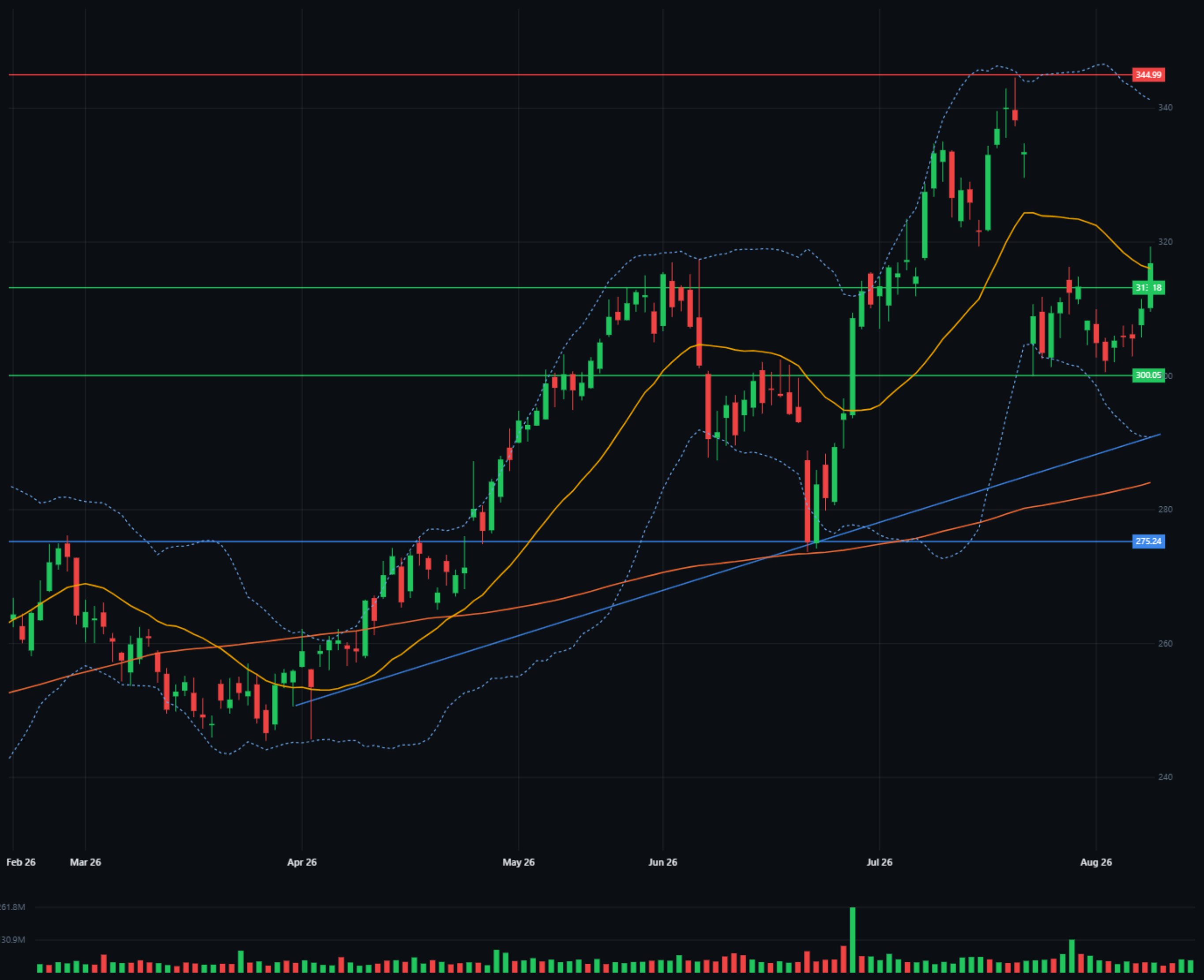
A stop loss is not set by how much feels comfortable to lose. It is set where your idea is proven wrong. Whoever enters on a breakout above 317 — that idea dies the moment price falls back below 313, because then the breakout was false. That is where the stop goes — not twenty dollars lower because it feels safer. And the arithmetic is done before the entry, not after:
When the ratio comes out worse than 1:2, experienced traders pass on the trade. The numbers above demonstrate the calculation on the levels drawn on this chart — they are not a call to action.
Three weeks stuck between 300 and 317 — and price is now pressing the top of that range. Bollinger bands squeezed to 291–318: a market storing energy. The chart still hasn't said which way it releases.
A 13% drop in two sessions around the July 30 earnings. The fast moving average near 320 still points down — overhead pressure. Tuesday's close above 313 is the first real push against it.
The 150-day average keeps rising at ~284, well under price. The April trendline is unbroken. Two different pictures — don't mix them.
Earnings on October 29, 2026 — in 70 days. Last time moved the stock 13% in two days.
A long drift. The low: 250.65 on April 2. Everything started from here.
From 250.65 to 344.57 in four months. Mid-way, June 25 dropped 4.26% in a day — absorbed within weeks.
From 344.57 to 300.00 in two sessions on 132.5M volume — 2.5× average. The break.
Three weeks sideways. Volume dried up — until Tuesday's push to a close above 313, the range's first real challenge.
After the earnings shock both sides lost interest — volume shrank for three straight weeks inside a narrowing range. Tuesday broke the pattern: interest returned on the push into resistance, but at 50M it is still below average. Interest is back; conviction is not proven. That is exactly what the confirmation rule in the scenarios below is for.
All figures from the platform's Key stats and the July 30 report (Q3 FY2026), as of August 20, 2026. The chart tells you what the crowd is doing; these numbers tell you what it is paying for.
About 27 cents of every revenue dollar survives as profit — margin at a level few businesses at this scale reach, and the first thing the premium multiple below is paying for.
A P/E of 36 means the market pays $36 for each $1 of trailing profit — a premium multiple. It says growth expectations are already in the price, which is also why an earnings surprise moves the stock 13% in two days.
Profit is growing almost twice as fast as revenue — margins are widening, not just sales. Note the paradox on the chart: this beat was answered with a 13% drop, a reminder that price reacts to expectations, not to results.
Beta measures how the stock moves relative to the whole market: 1.09 means roughly 9% more than the index, both directions — a near-market temperament, not a speculative one. The dividend exists but is not the story at this yield.
| Support | A price where buyers kept showing up in the past. A floor that has been tested. |
| Resistance | A price where sellers kept stopping the advance. A ceiling. |
| Moving average (MA) | The average of the last X closes. Smooths noise, shows direction; 150 days = the long trend. |
| Bollinger bands | A 20-day average ± 2 standard deviations. Narrow bands = a calm market, often before a move. |
| Volume | How many shares changed hands. A move on heavy volume means something; on light volume it is suspect. |
| Trendline | A line connecting rising lows. While unbroken, the trend stands. |
| Stop loss | A pre-set exit that defines how much you lose if you're wrong. |
| False break | Price closes beyond a level, then falls straight back — trapping whoever chased it. |
| Consolidation | A stretch where price moves sideways in a tight range, direction undecided. |
| P/E (price to earnings) | The share price divided by a year of profit per share. How many dollars the market pays for $1 of earnings. |
| EPS (earnings per share) | The company's profit divided by its share count — the profit your one share represents. |
| Net margin | Profit as a share of revenue: how many cents of each sales dollar survive as profit. |
| EBITDA margin | Operating profitability before interest, taxes, depreciation and amortisation — a cleaner look at the core business. |
| Beta | How much the stock moves relative to the whole market. 1.0 = with the market; above it, more; below it, less. |
The technical half was read directly off SigniBull's Full chart: support and resistance taken from tested highs and lows by hovering the candles themselves, drawn with the platform's drawing tools, and cross-checked against the trendline, the 150-day moving average, Bollinger bands and volume as the confirmation filter. The fundamental half uses the platform's Key stats and the July 30 quarterly report — P/E, EPS, margins, beta and growth rates, with the one derived figure (net margin) computed from those — and no external sources, models, or price targets anywhere.