Three people open this app for three different reasons
You do not have to pick one. The app is the same app; what changes is which part of it you spend your time in.
Learning the market
Paper-trade with real prices, and read a 24-lesson academy that says what each indicator does not tell you as clearly as what it does. Start with lesson one.
Already trading
Charts with 17 configurable indicators, alerts that reach your inbox, heat maps of your own portfolio, and a full earnings and economic calendar — one place to watch what you hold.
Wants to be followed
Make a portfolio public and let the record speak. Every position carries provenance you cannot edit, so a good year is provable — and other members can see it.
Seven things it does, none of them a separate subscription
Anywhere else these are seven tabs across four accounts. Here they are one screen that already knows what you own.
Your portfolio, its provenance, and the market around it — on one screen
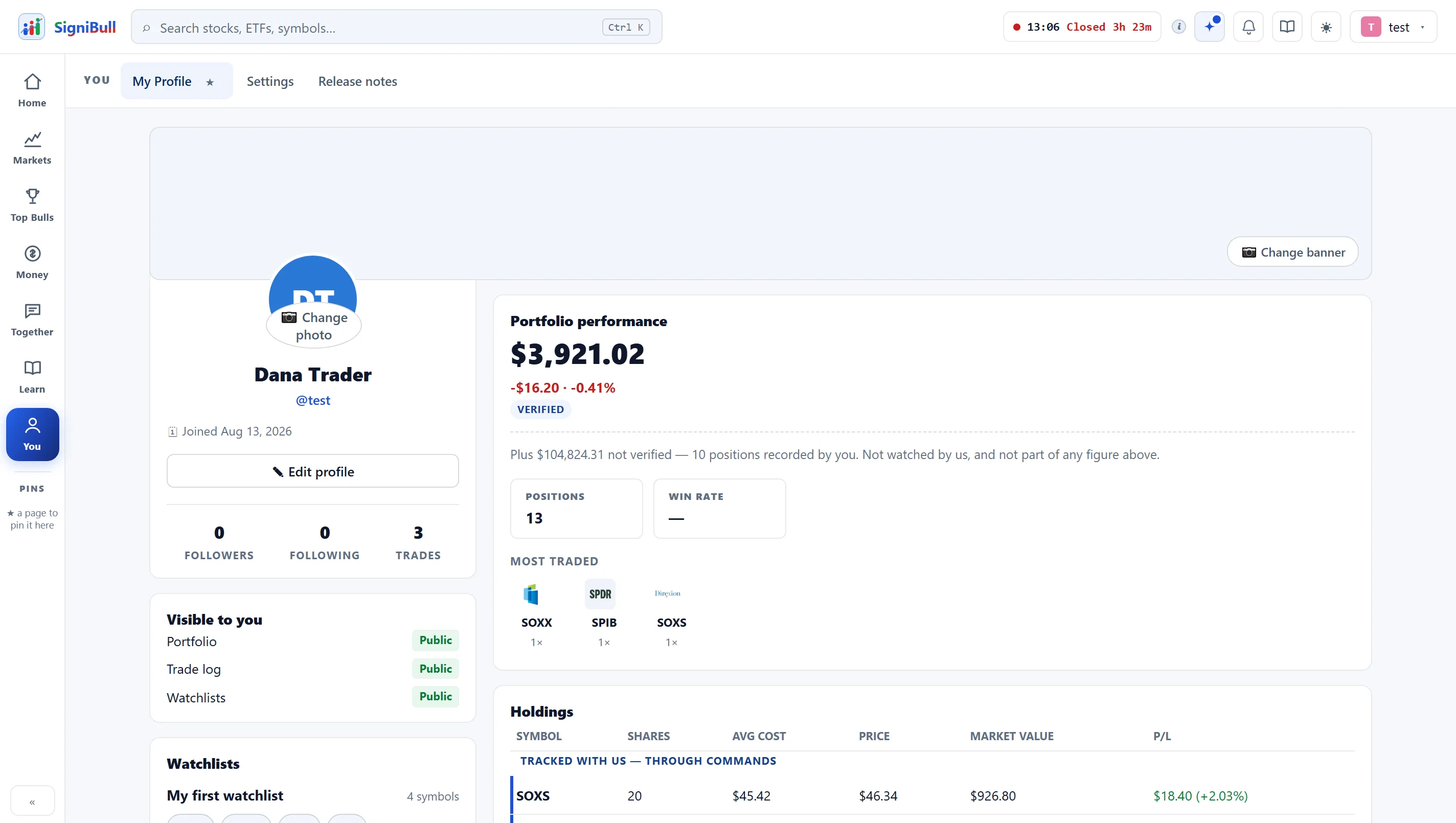
The number at the top and the rows beneath it are computed by one rule, so the card and the table can never disagree about your money.
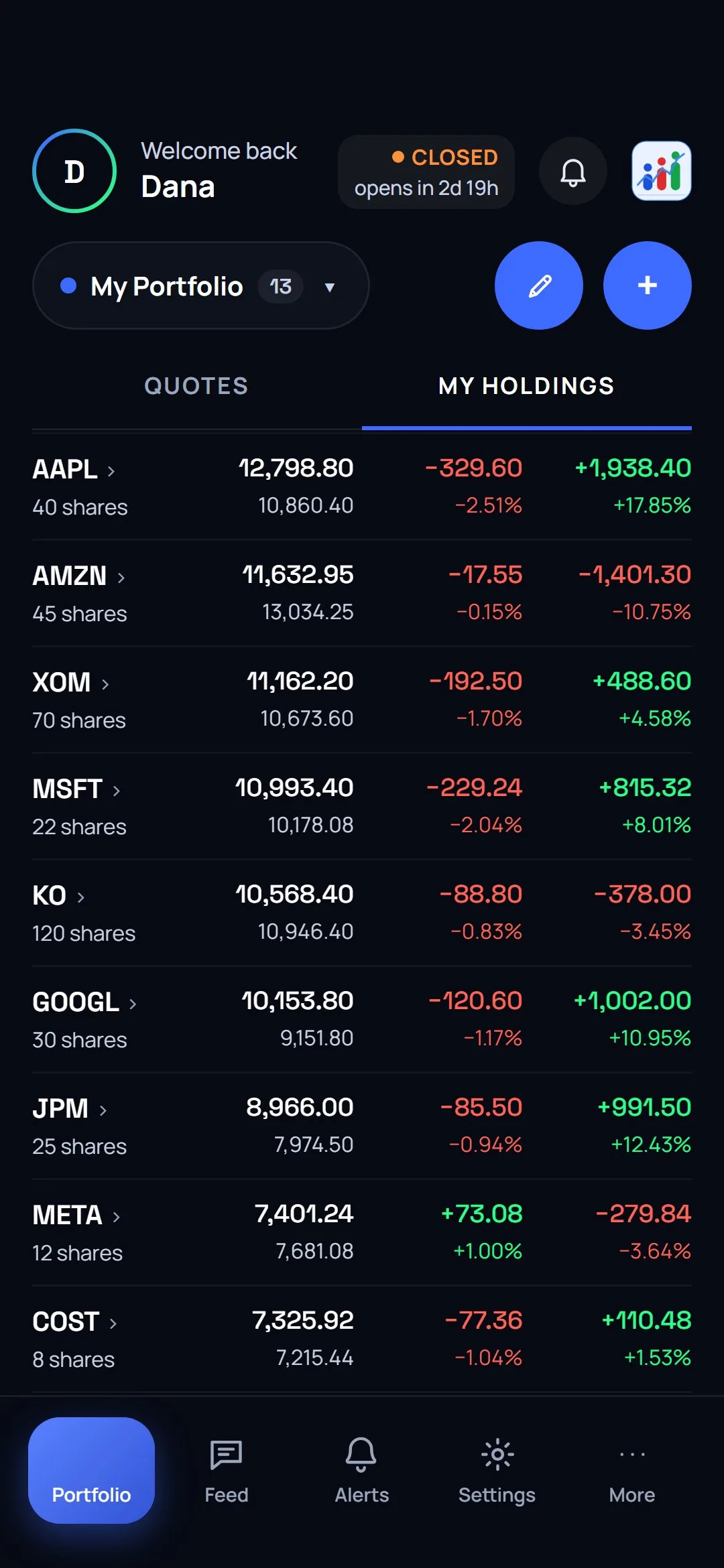
every row opens its purchases
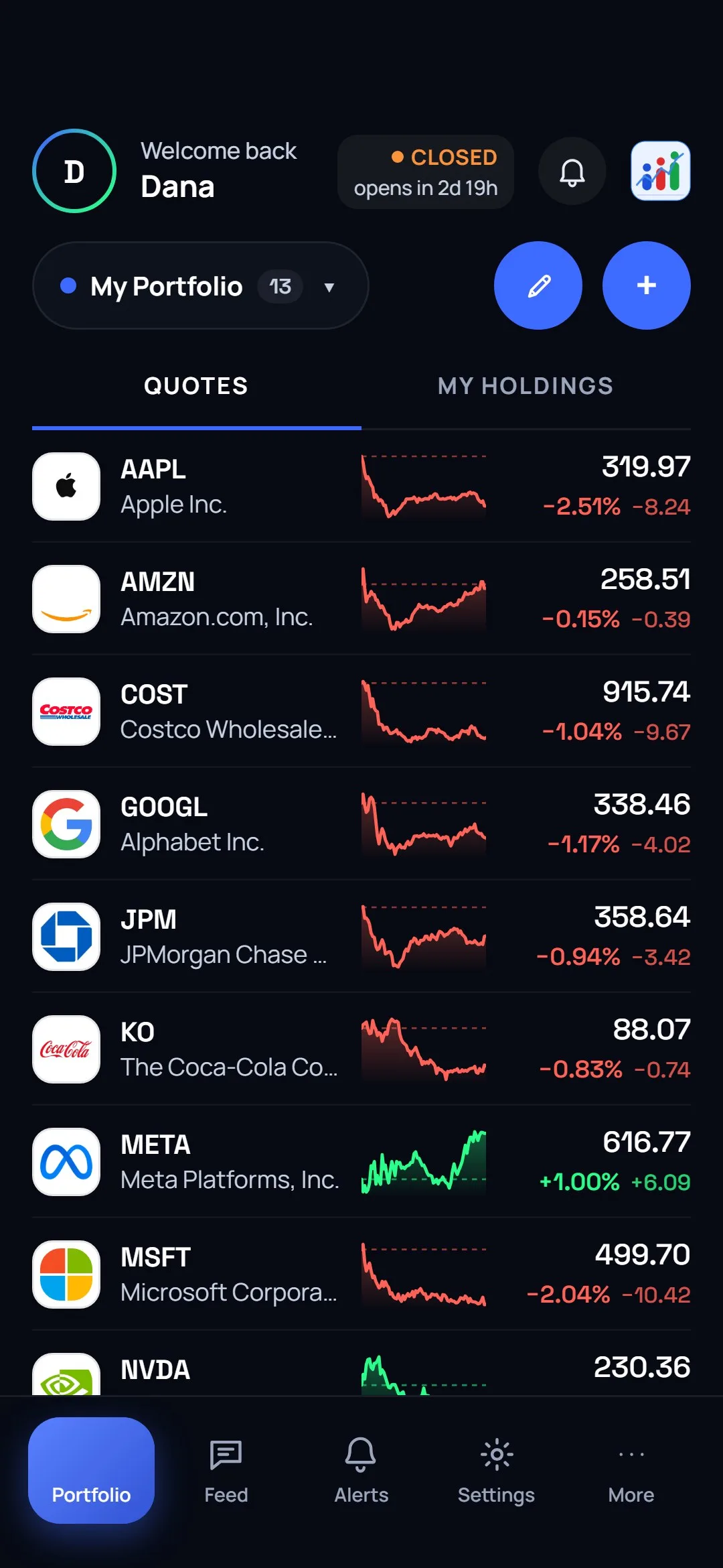
we priced and what you typed
One account, as many lists as you actually think in
- A portfolio and any number of watchlists, each with its own name and its own colour, switched from one dropdown.
- Every purchase kept as its own line — quantity, price, date — instead of one blended average you cannot unpick.
- Symbols that cannot be priced are counted, never dropped, so a total is never quietly missing one of your holdings.
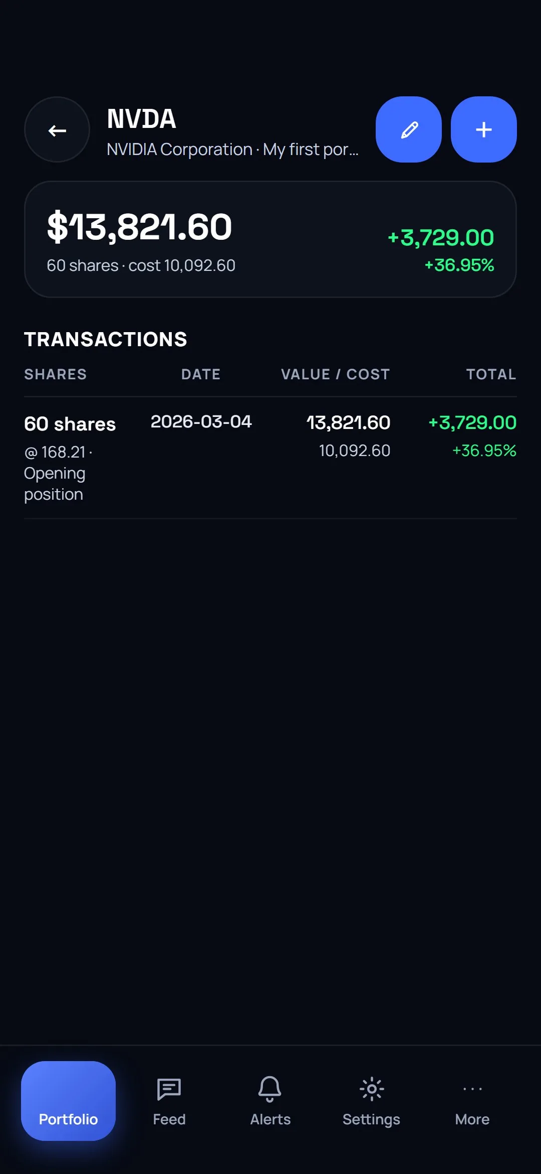
editable, removable, dated
A track record the person holding it cannot edit
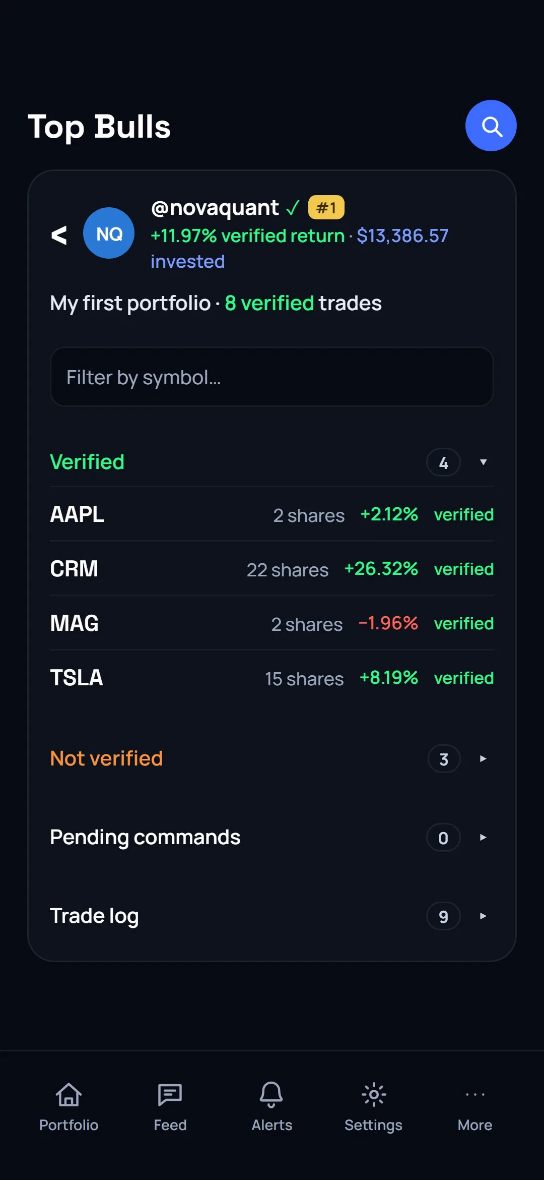
- The app records the price at the moment of the trade. That row is stamped verified and the database refuses to let any client relabel it.
- Anything typed in stays marked as typed in — including holdings from before you joined. Both count in your own totals; only verified ones count in anything other people see.
- Top Bulls ranks verified returns only. A loud year and a real one are not the same row.
- Public portfolios are open, so anyone can see the trades behind the number rather than the number alone — and channels, friends and messages sit in the same app, so the conversation is next to the record. More on how social trading works here.
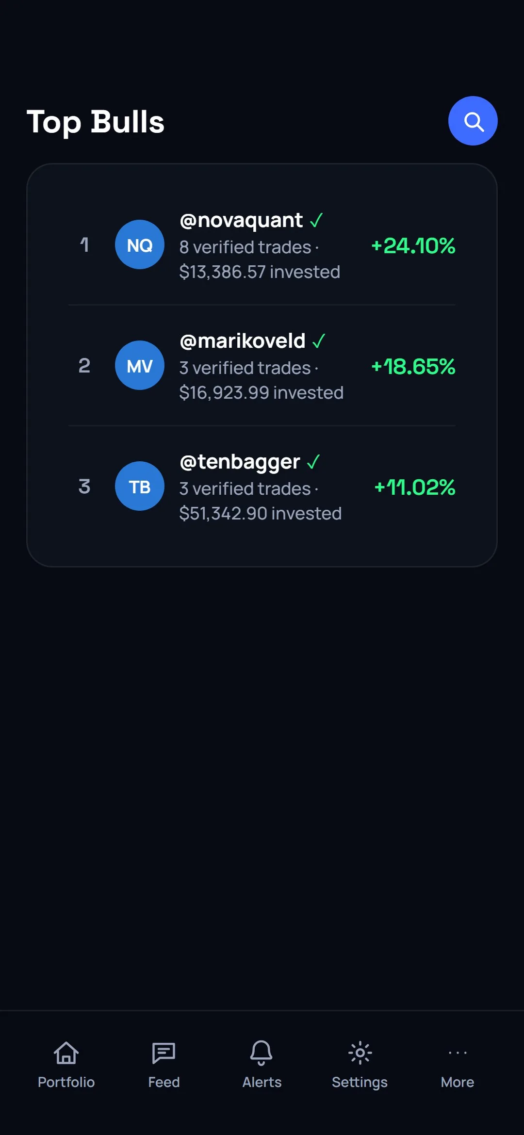
Screens people come back for
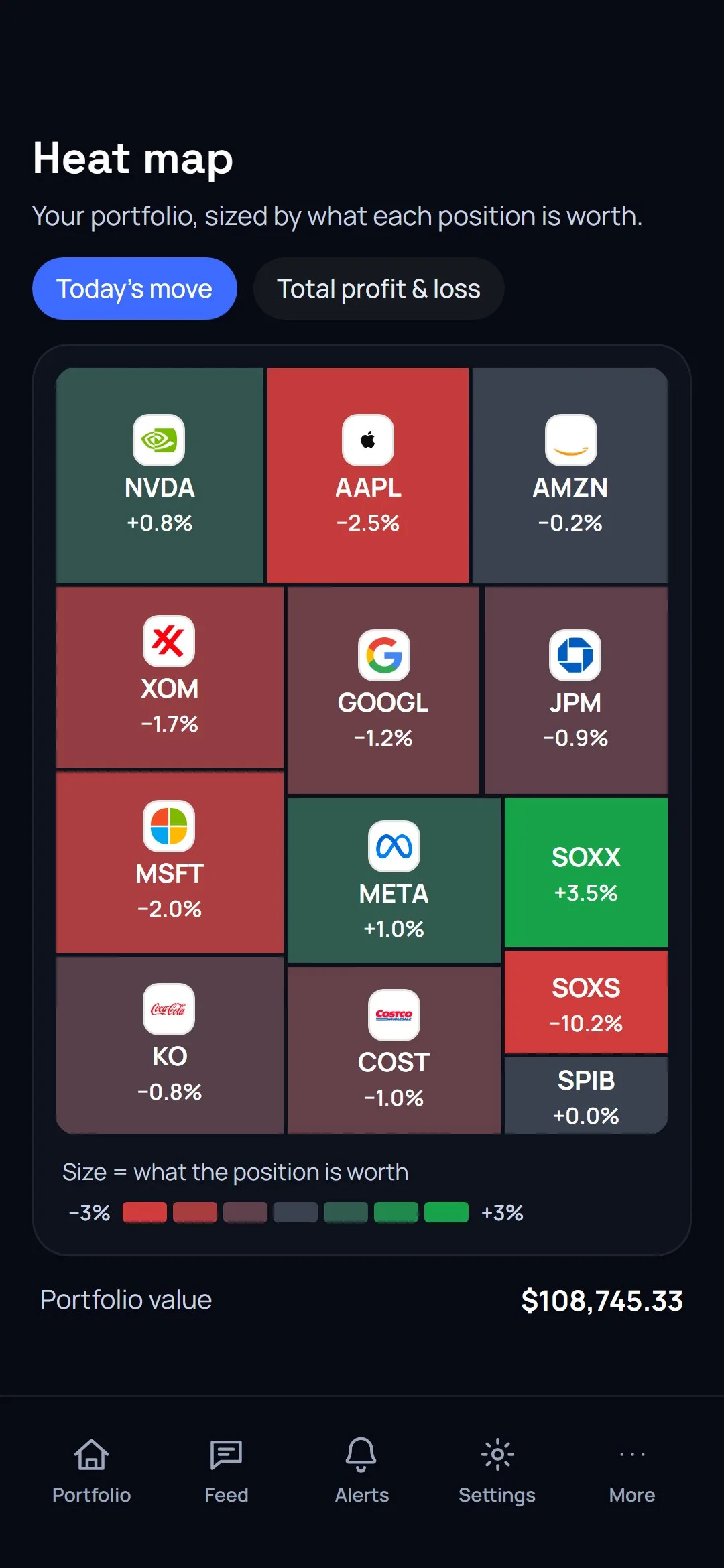
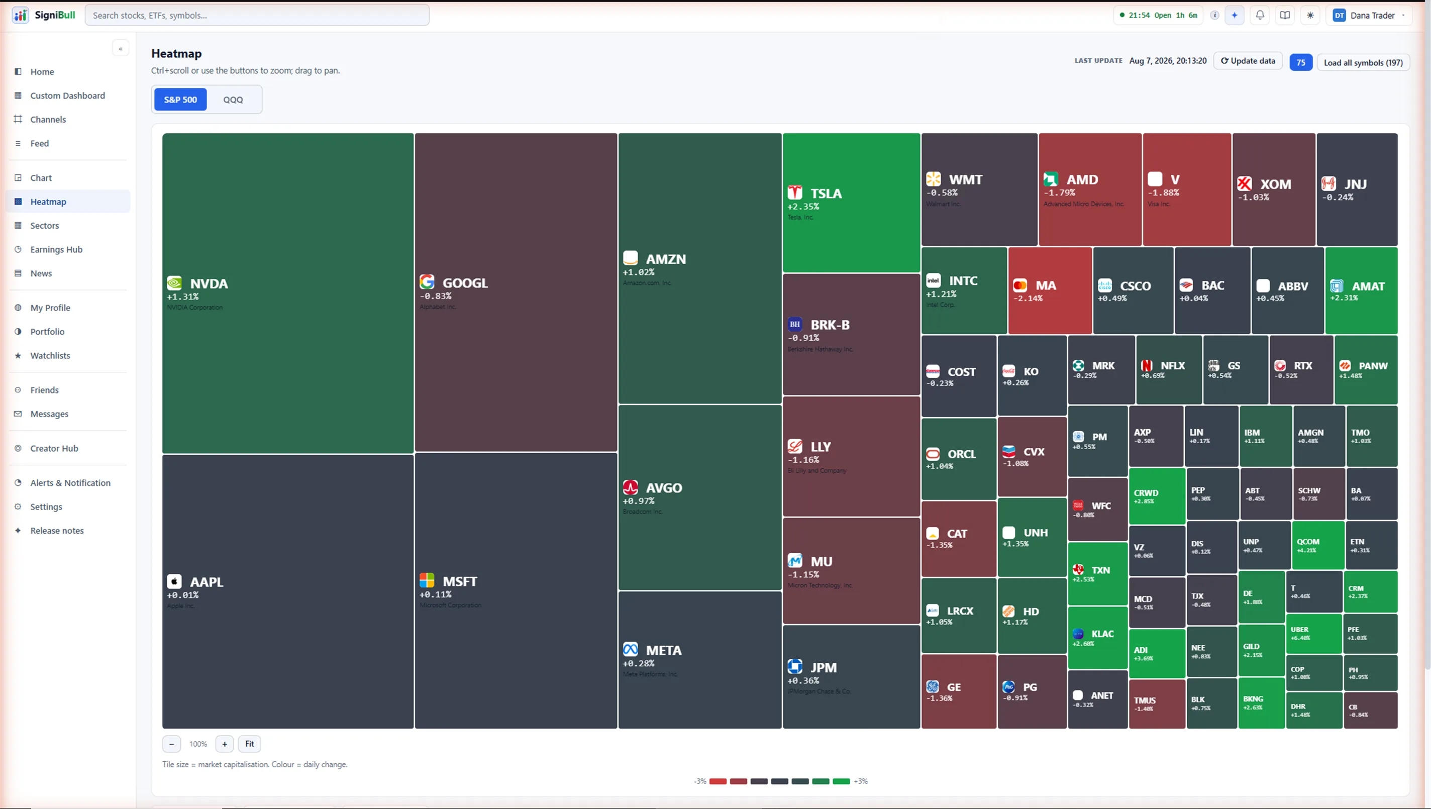
Your portfolio as a heat map
Every holding drawn at the size of what it is worth, in that company’s own logo colour — or in green and red, scaled to your portfolio rather than a fixed 3%. Your choice is saved to your account. New to it? Start with how to read the heat map.
Written analyses, free to read
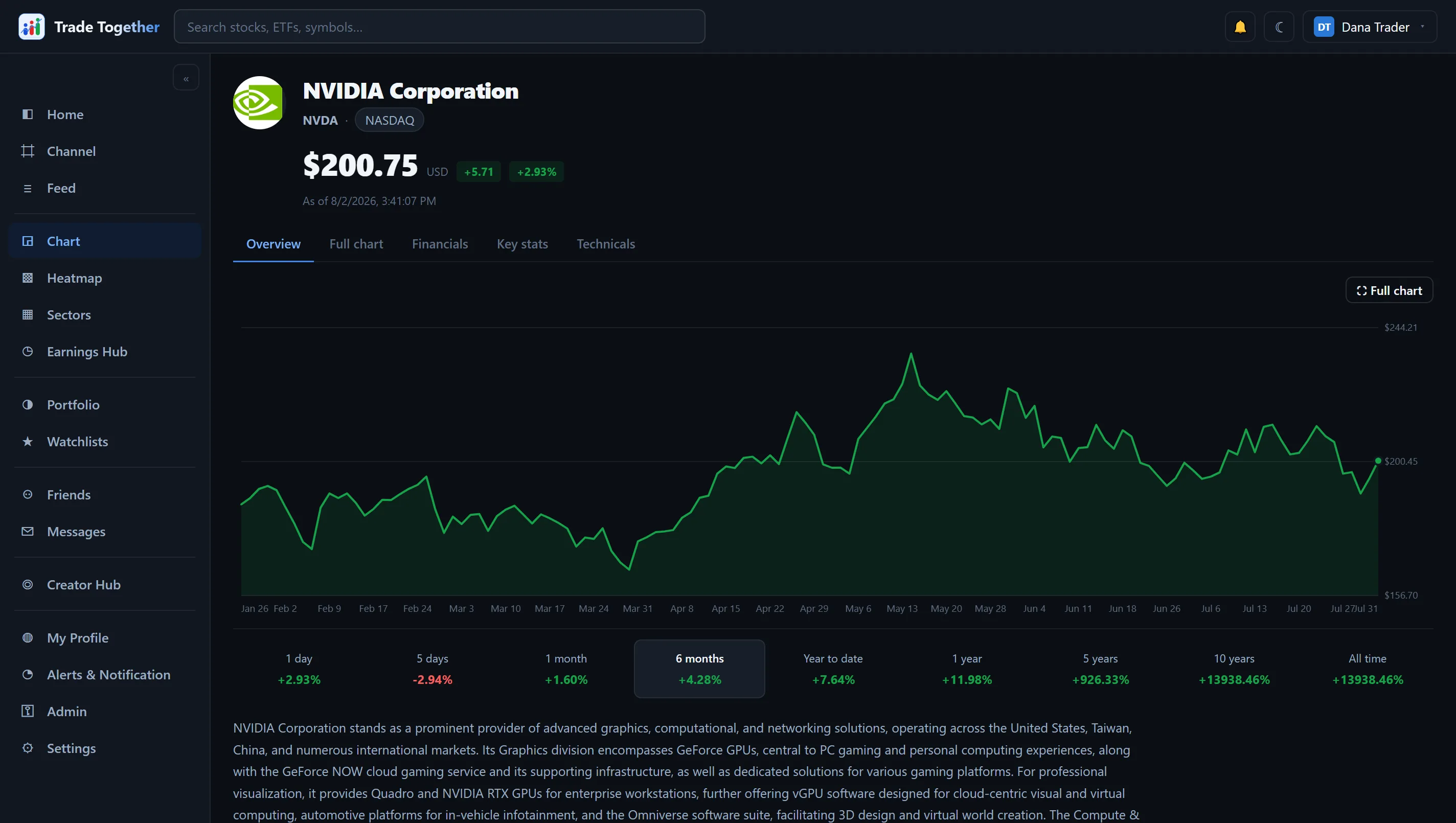
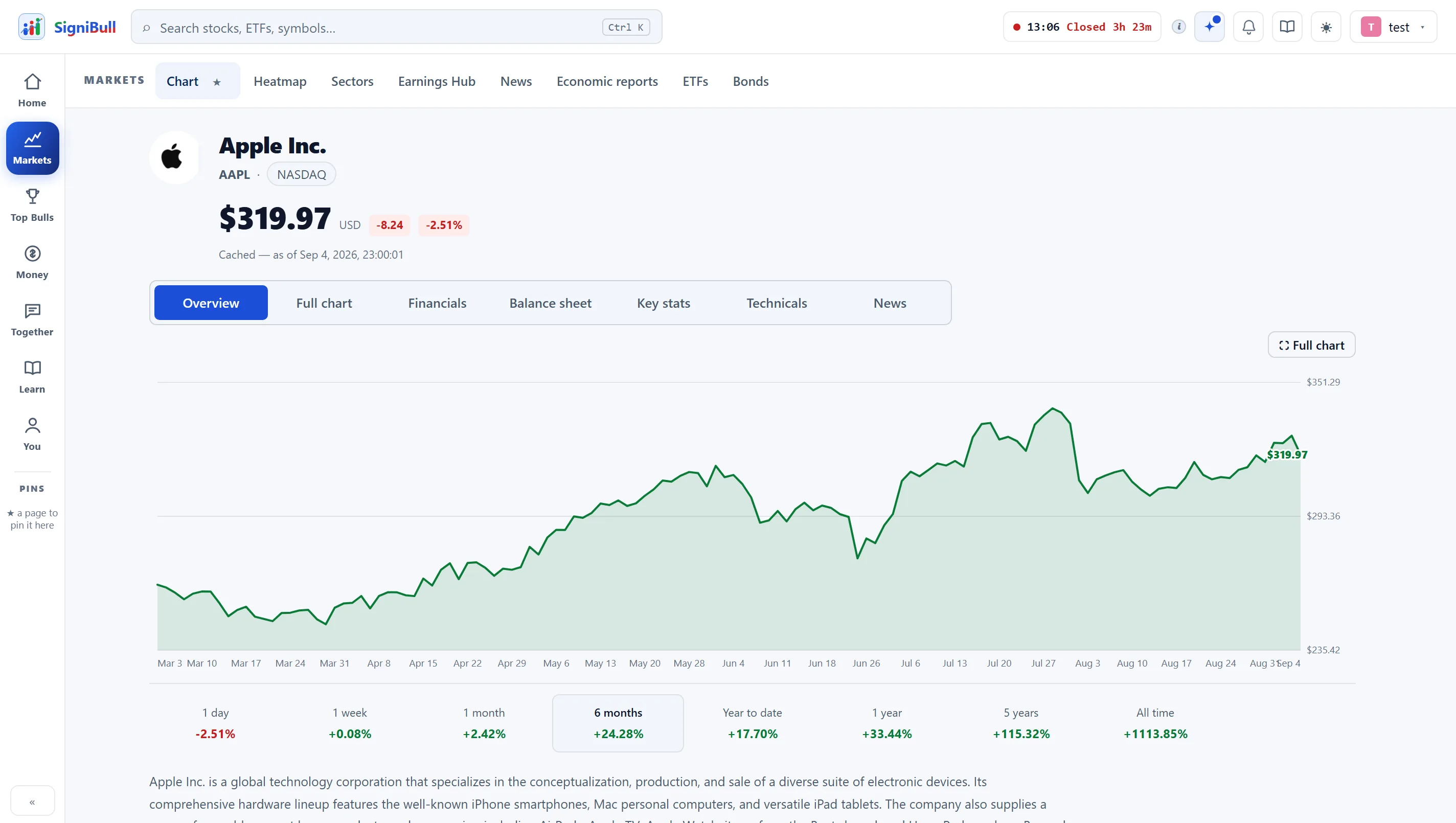
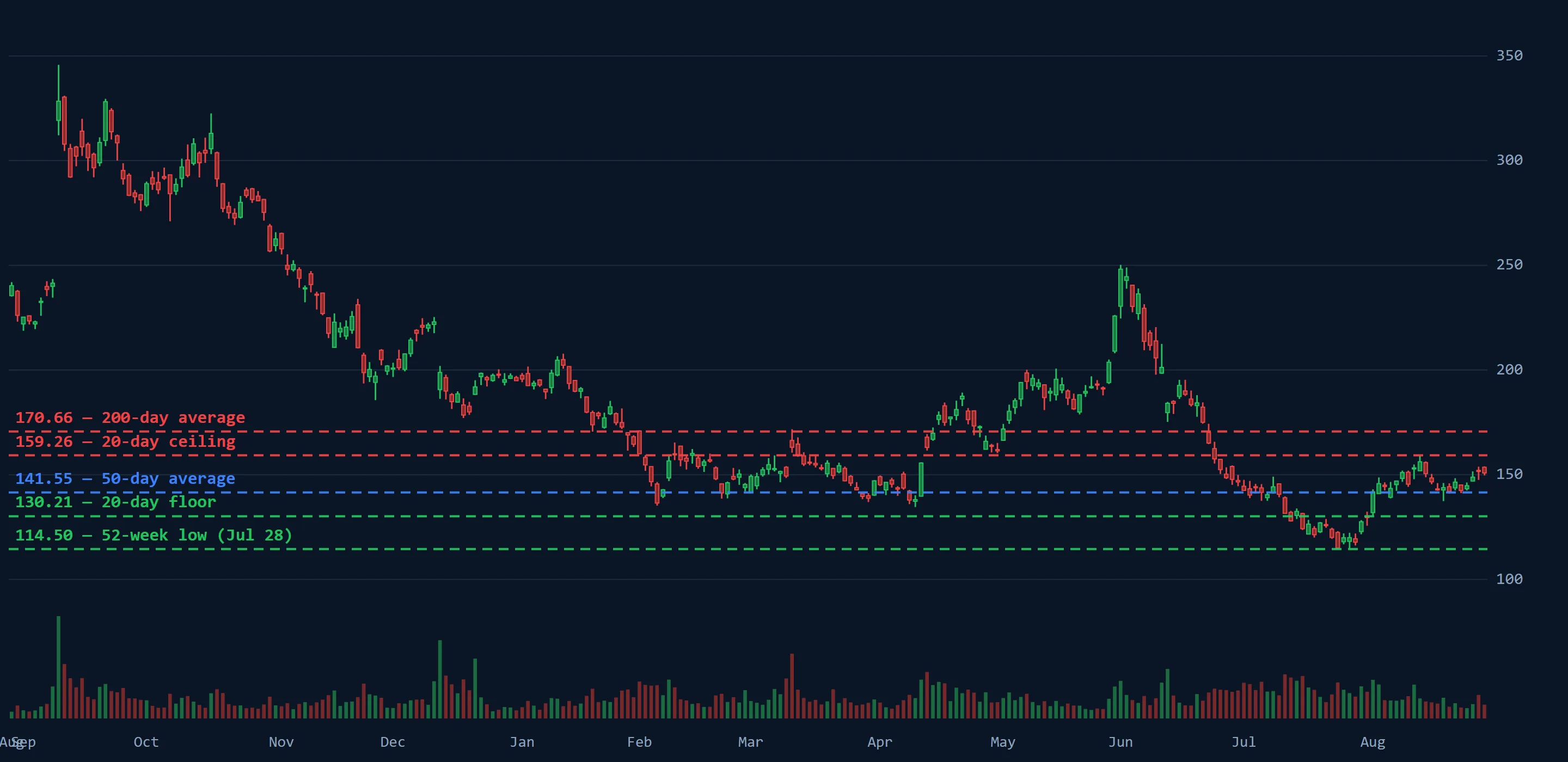
Technical and fundamental, on one company, with the levels drawn on the chart and a section that names the single price that would make the piece wrong.
Alerts that leave the app
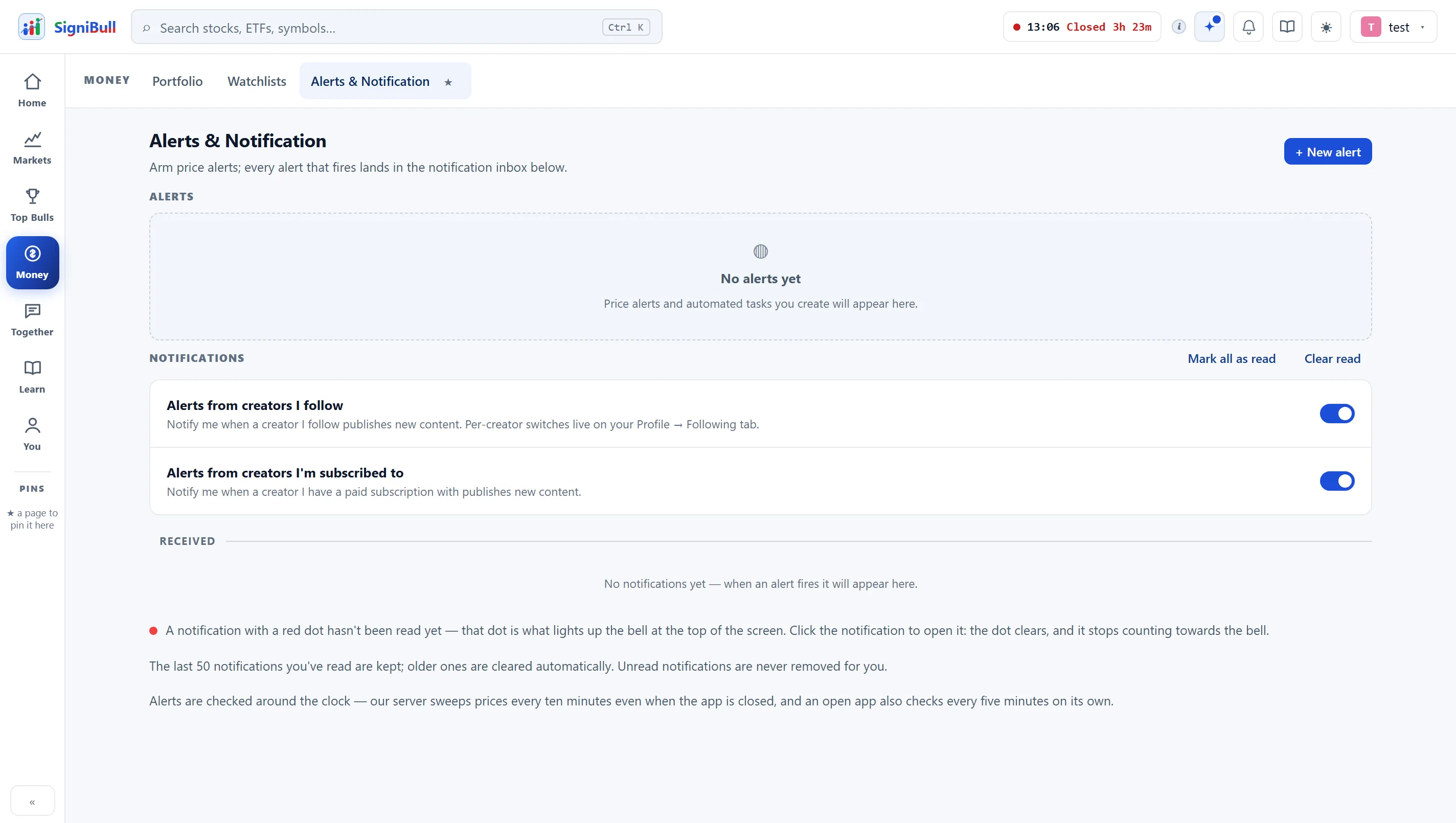
Set a price on any symbol and it reaches you by email as well as in the app, so you do not have to be looking at the screen for it to be worth setting.
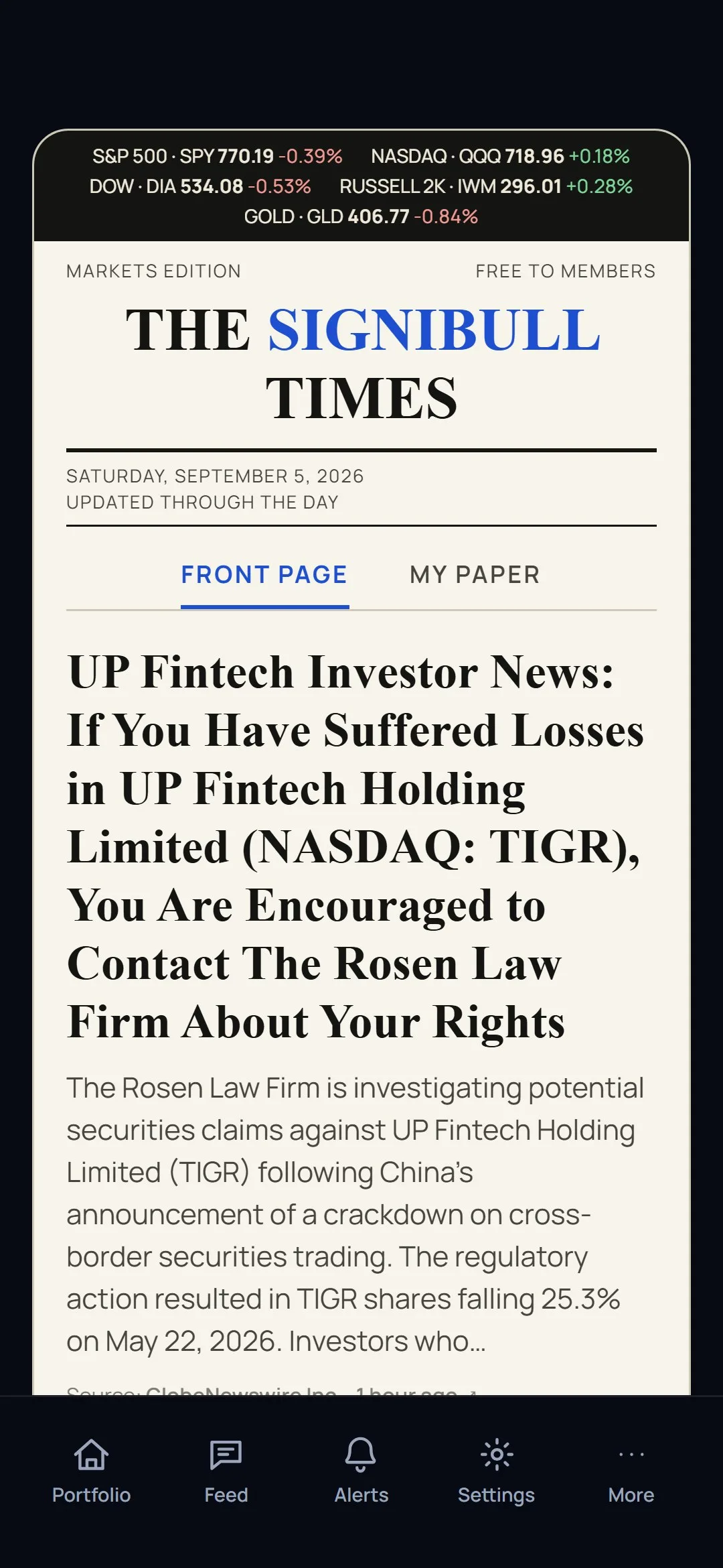
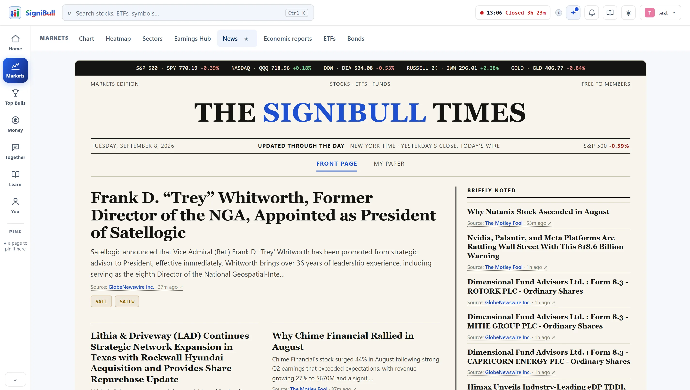
The rest of the market, not just your shares
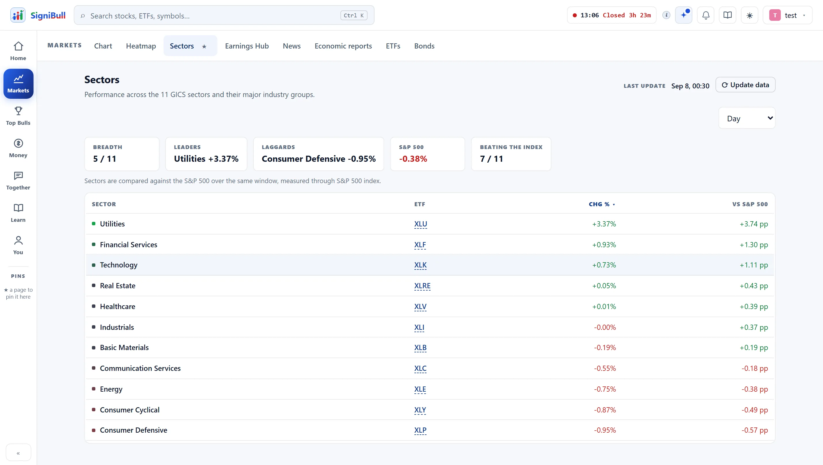
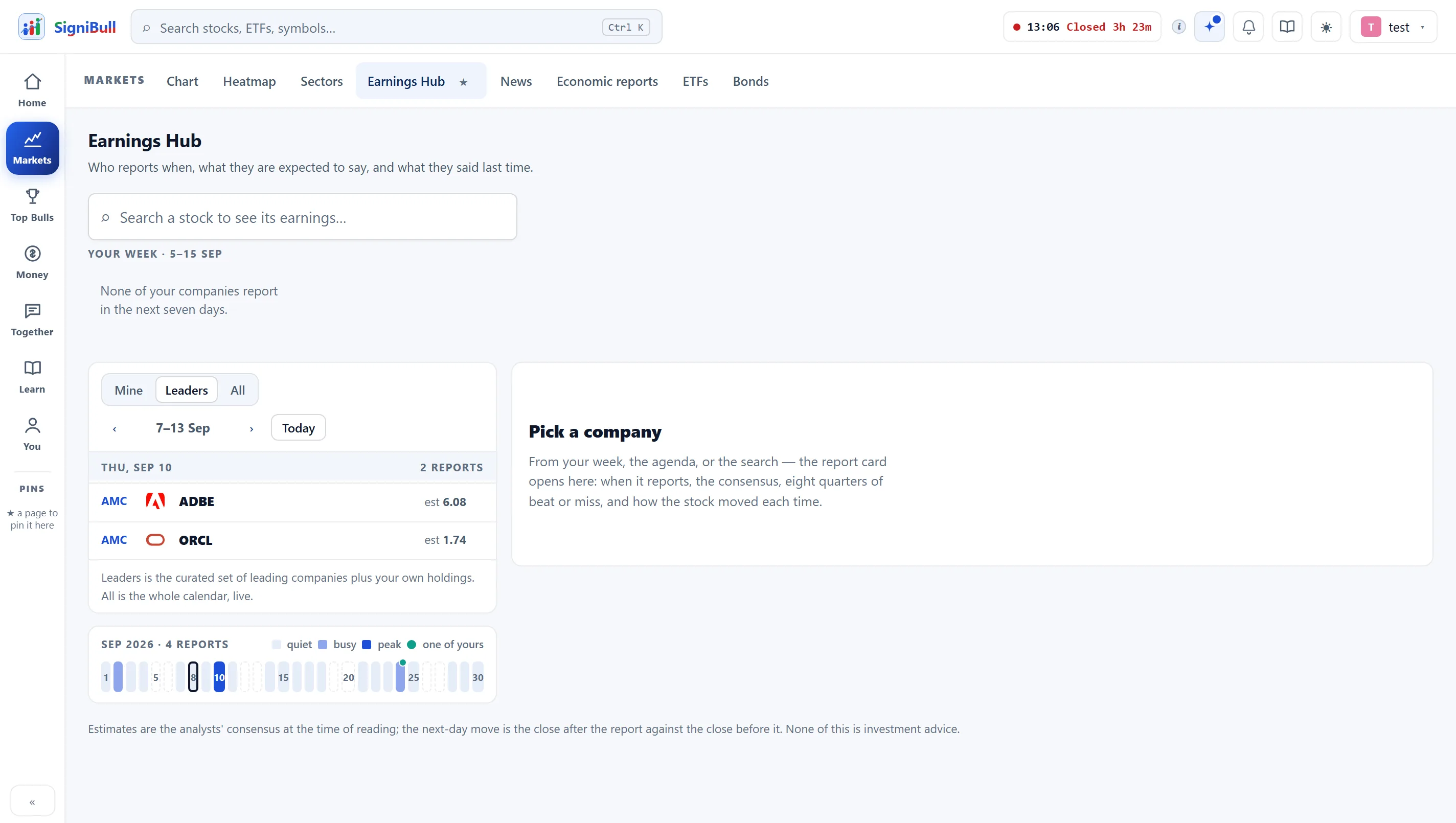
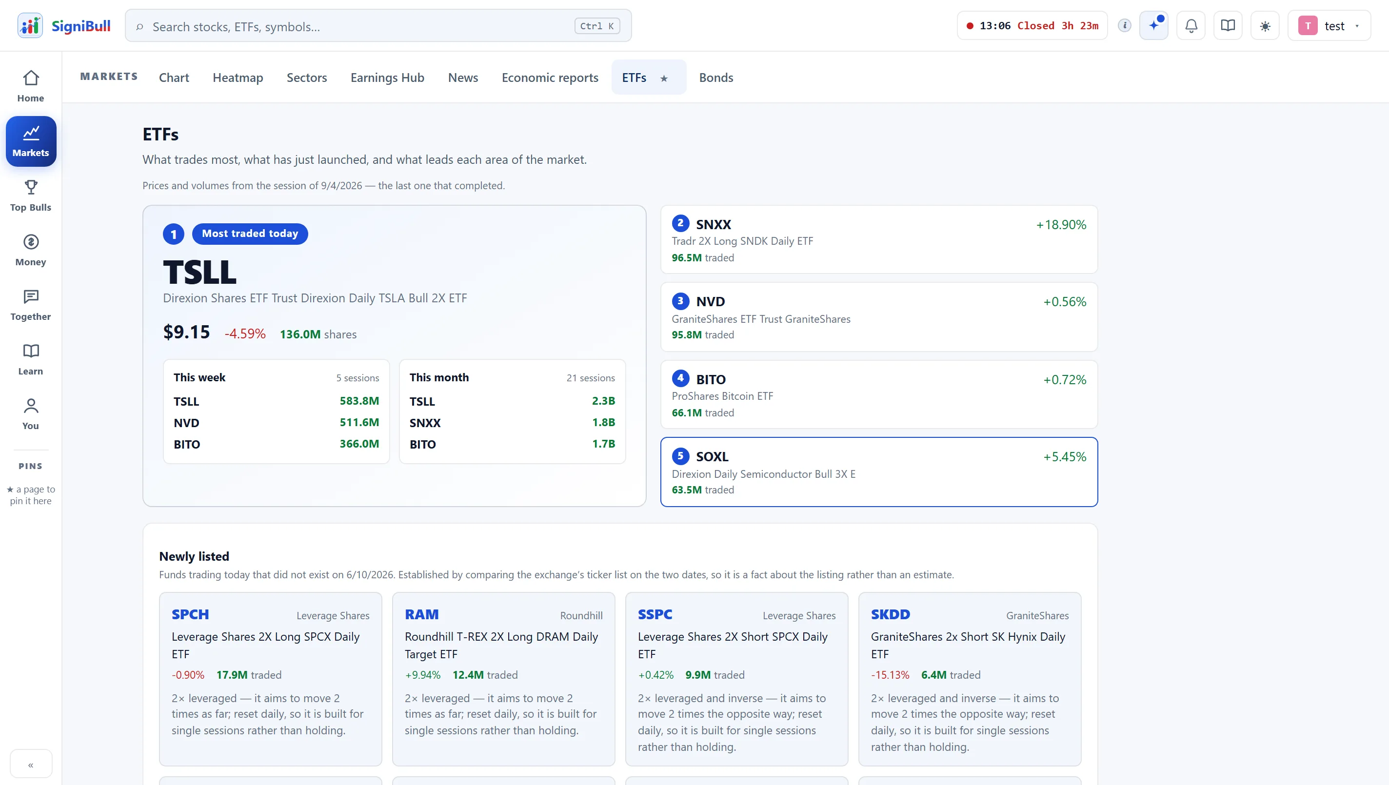
ETFs by what actually trades, bonds and the yield curve, and the economic releases that move all of it — each one its own tab rather than a panel bolted onto something else.
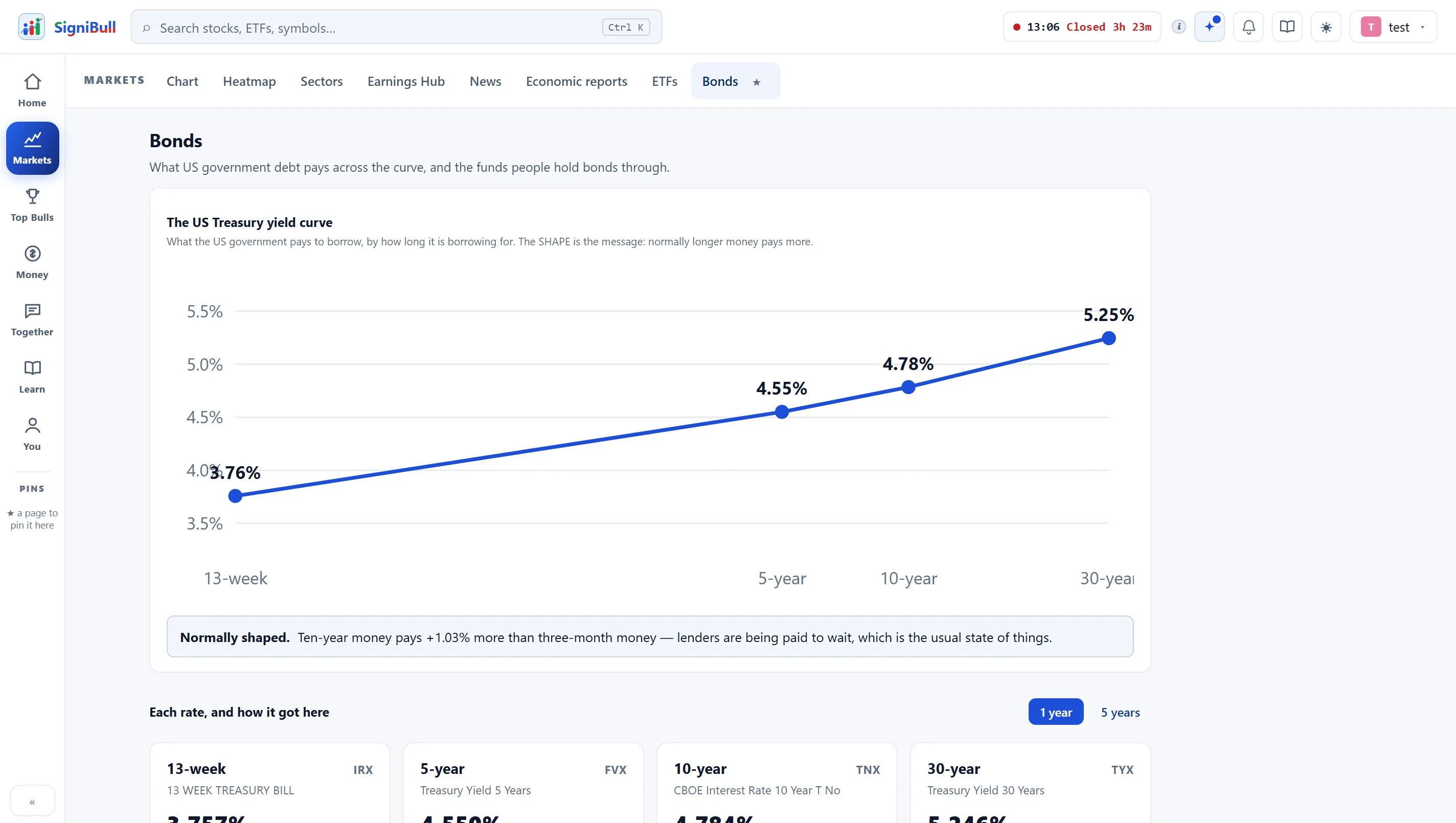
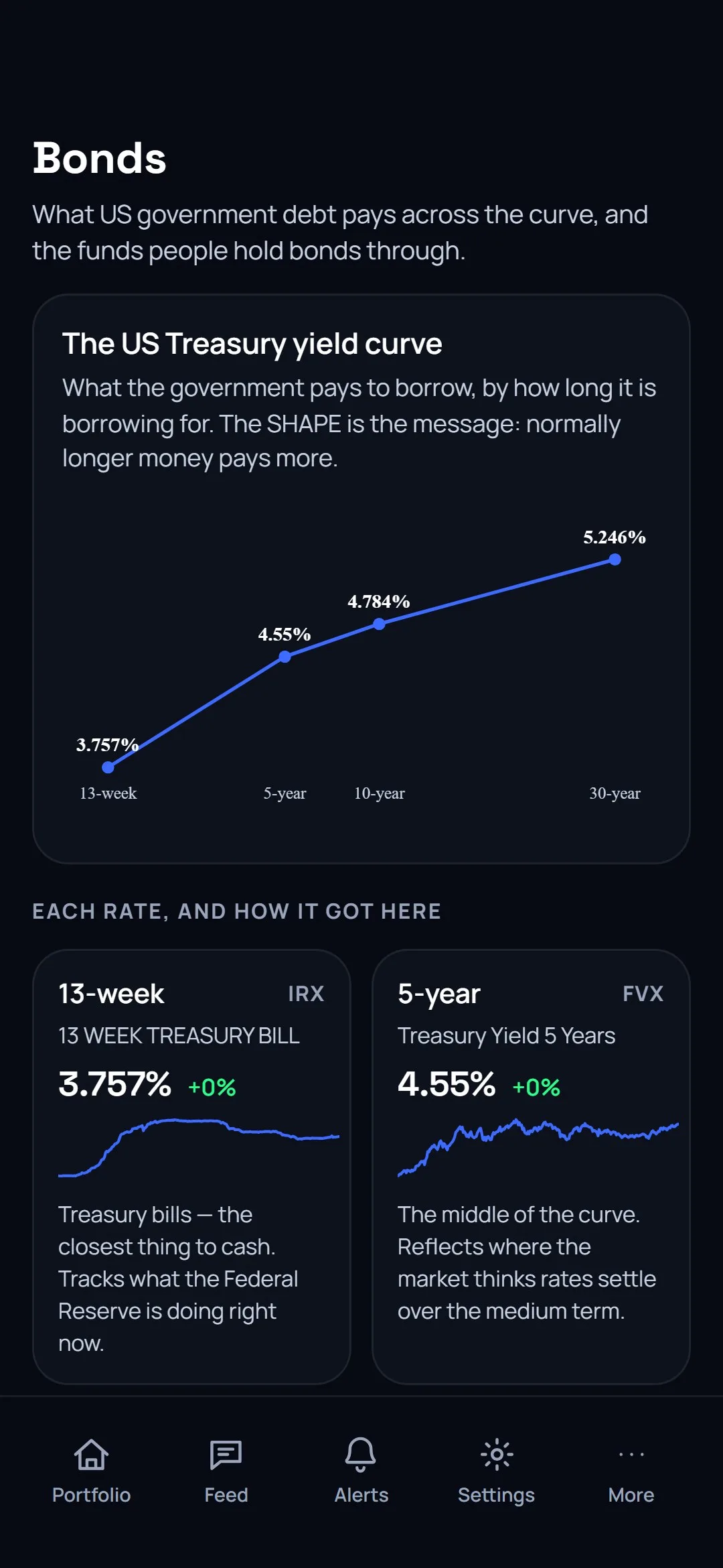
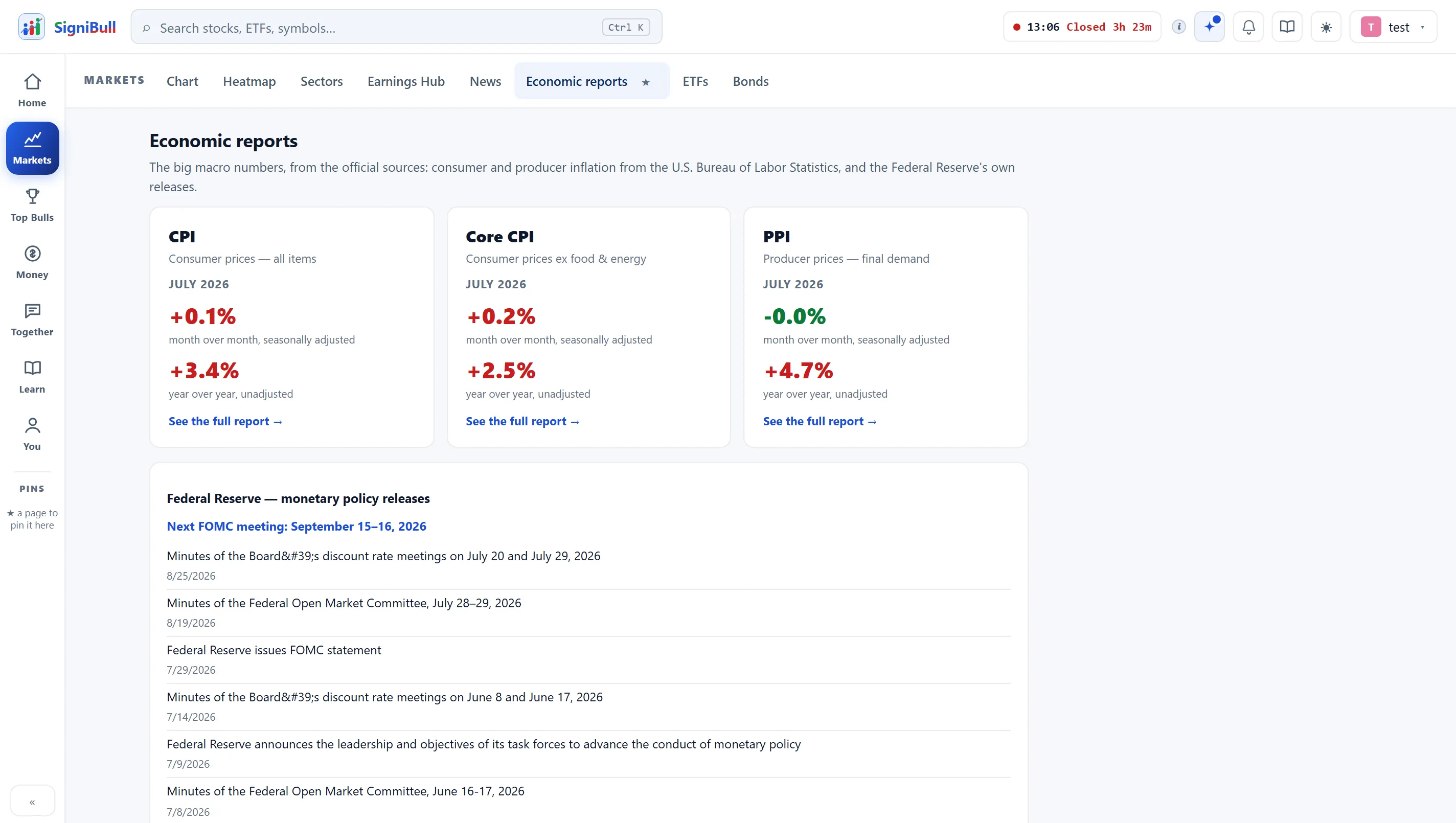
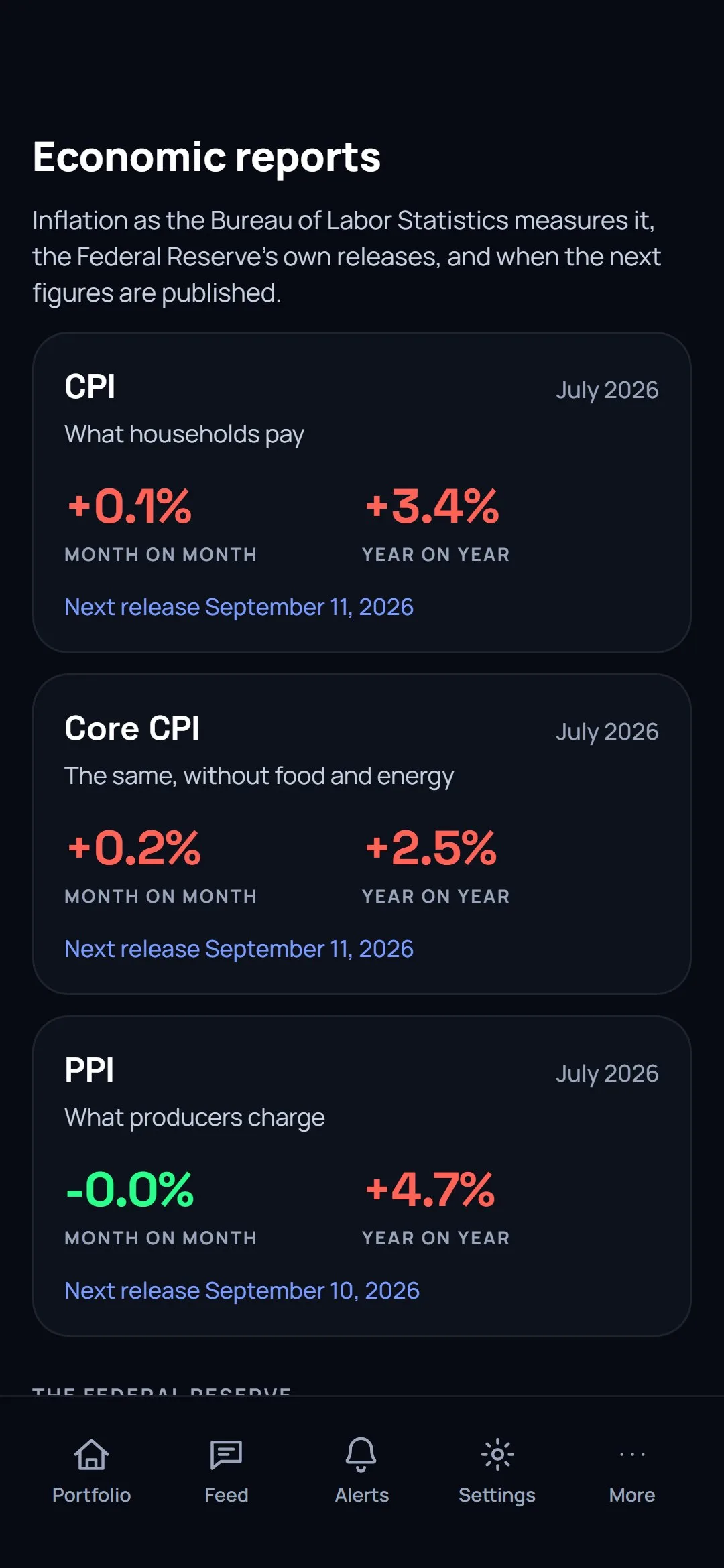
The same account on your phone
The portfolio, the charts, the analyses and the community, signed in with the account you already have — nothing separate, nothing to import.
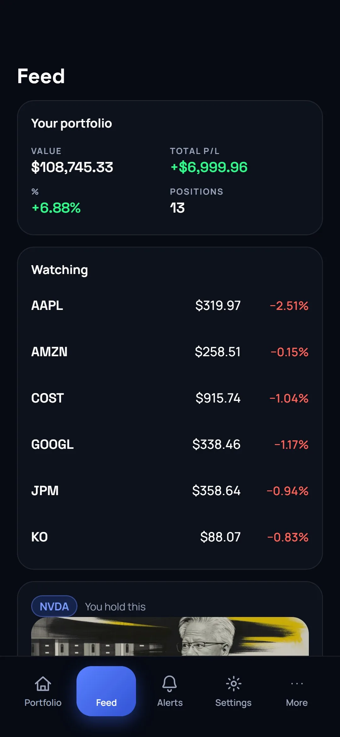
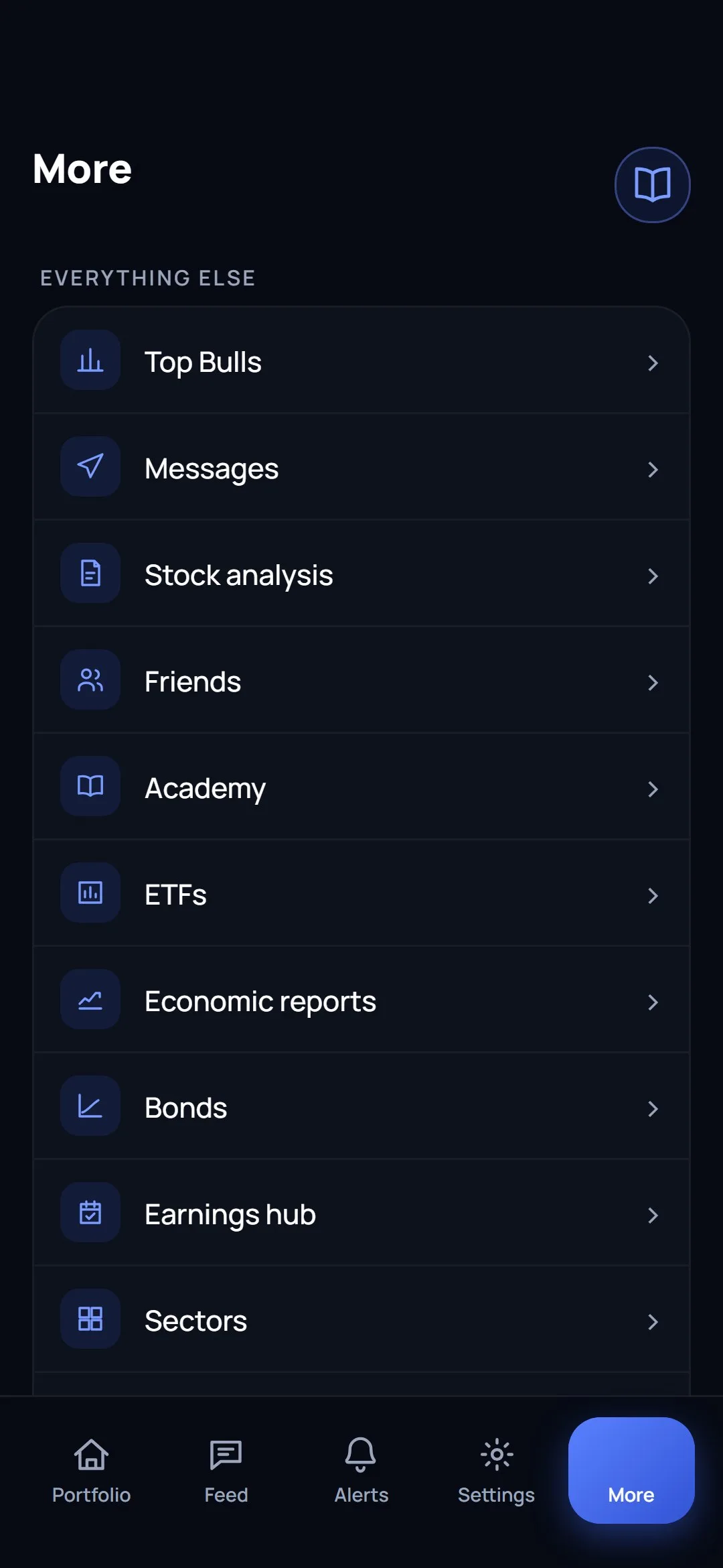
Look at the same market however you think about it
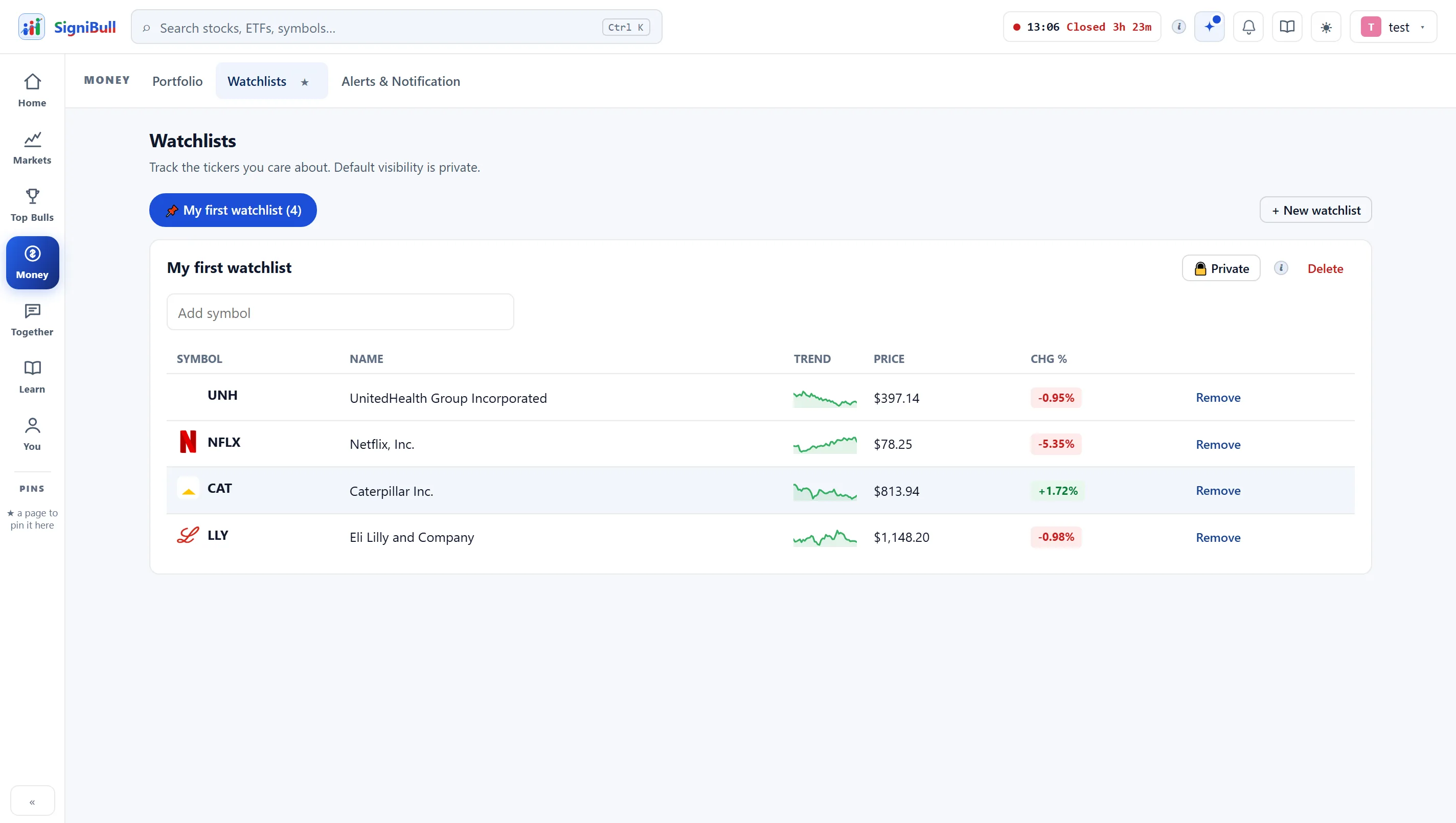
- Price, day move and a sparkline on every row of every list.
- Held symbols are marked, so a watchlist you also own reads differently.
- Your own symbols price first and appear before the suggestion board.
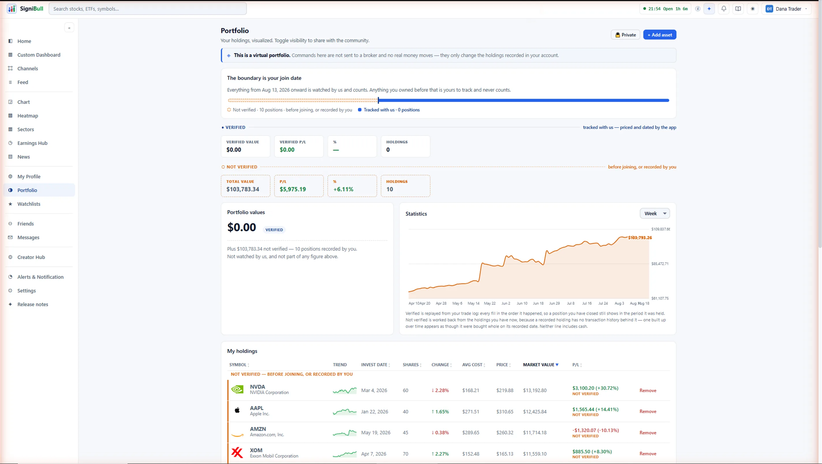
- Four columns: symbol, value over cost, today, total.
- Every row opens its own purchases, each one editable or removable.
- The verified split sits under the total, with the colours explained behind an ⓘ.
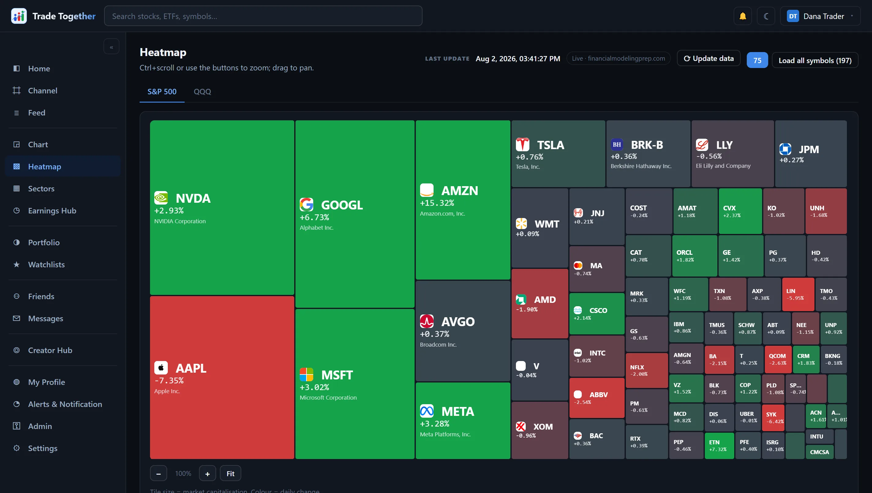
- Your portfolio, the S&P 500, the Nasdaq-100, sectors and the majors.
- Brand colours or performance colours, chosen with two buttons.
- Boards load from a shared copy, so the first viewer warms it for everyone.
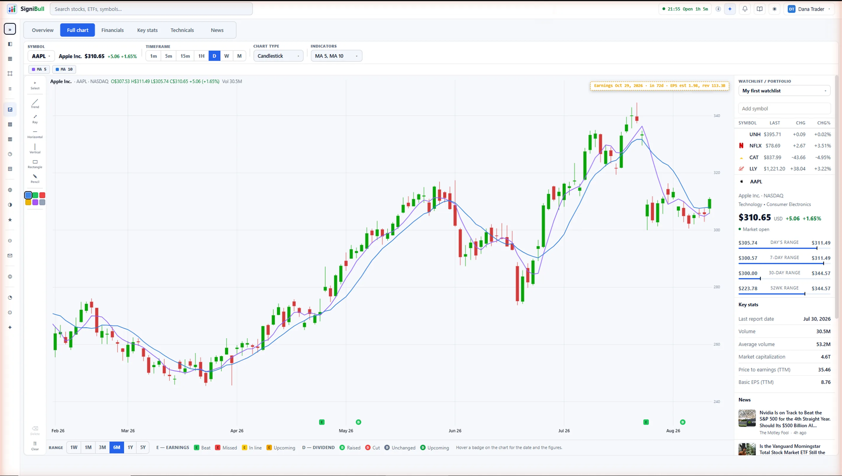
- Candles or a line, 1D to 5Y, and the choice is remembered.
- 17 indicators with editable parameters, saved per company and followed to any device. They are free stock charts in the full sense: no paywall, no trial clock.
- Drawings you make are saved to your account, not to the browser.
Three steps, and the third is the one that matters
1 · Record a trade
Enter it yourself, or let the app price it at the moment you make it. Both are allowed and both are kept.
2 · It is stamped
A trade the app priced is written as verified, with the price it fetched. One the member typed is written as not verified. Neither label can be changed afterwards.
3 · The board reads the stamp
Top Bulls counts verified returns only, so being on it is a fact about your trading rather than a claim about it. It is all paper trading — prices are real, the money is not.
24 lessons that also say what an indicator cannot tell you
- Four chapters, from what a share is to how to read a company’s numbers.
- Every lesson carries a worked example with real numbers.
- Plain-English digests of the latest economic releases, on the app’s Economic reports page.
- Free, with no account needed to read the lessons.
Start with one holding. See what it is really doing.
Free for everyone — every chart, every channel, every alert. No card, no trial clock, and your first portfolio takes about a minute.
Questions first? The FAQ answers the usual ones, and the user guide explains every screen.