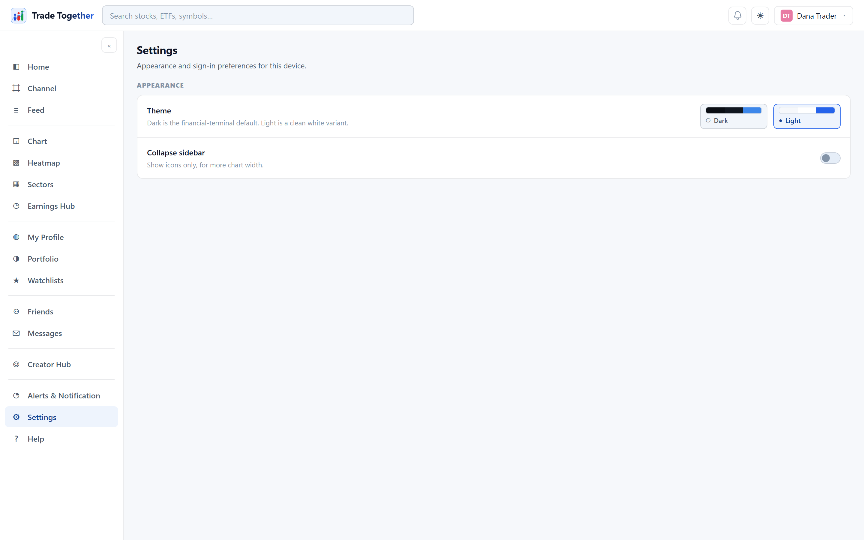
Deliberately small. The controls at the top are about how the app looks and reads on this device:
- Theme
- Dark is the default — it is the financial-terminal look the rest of the app is designed around. Light is a clean white variant. Click a swatch to apply it immediately. The ☾ button in the top bar does the same thing.
- Language
- English or עברית (Hebrew), each named in its own language so you can find yours whichever one the screen is in. Choosing reloads the app in that language. In Hebrew the whole layout runs right to left — the menu moves to the right, reading starts on the right — while prices, percentages, tickers and charts stay left to right, the way every market publishes them. The guide and the Academy are in Hebrew too; the blog and the emails are in English for now, and anything not yet translated shows in English rather than disappearing.
- Collapse sidebar
- Shows icons only, for more chart width. The same as the « button at the top of the sidebar. The menu starts open for everyone; only your own click — here or on that chevron — closes it, and that choice is remembered.
Everything about you — your name, username, bio, picture, links — lives on My Profile, not here. Your visibility choices live on the pages they affect: Watchlists and Portfolio.
Theme and sidebar belong to this device, not to your account. They are stored in the browser you are using, so signing in on a phone or a second computer starts you back at the dark theme with the sidebar expanded. That is deliberate: which theme you want depends on the room you are sitting in, and a screen bright enough for an office is the wrong one for a phone at night.
The theme is applied before the page draws its first frame, so a dark device never flashes white on the way in.
On a phone there is no sidebar to collapse — the bottom bar and the ☰ drawer take its place — so that control has nothing to act on and the page is a single choice wide.
What else this browser remembers. Alongside those two controls, it keeps which sidebar groups you had expanded, so a menu you opened last week is still open when you come back. None of it is account data: signing out leaves all of it exactly as it was, ready for the next person to use this browser, and clearing your browser's site data resets every one of them to the defaults. If the app ever looks wrong rather than behaves wrong, that reset is the first thing to try — nothing you own is stored here, so there is nothing to lose by it.
Emails
Monthly newsletter — one email a month with what changed in SigniBull and which stock analyses were published, the same words as the release notes and the analysis library. Off until you switch it on; every issue carries a one-click unsubscribe that works without signing in, and past issues are public at signibull.com/newsletter.
Getting-started emails — the short series that nudges the next unfinished First step, at most one every two days and never more than four in total. It is the same yes-or-no the welcome wizard asks, so wherever you answer, the answer is one: turn it off here and the series stops; every email also carries a one-click unsubscribe that works without signing in. Off is the default — nothing is sent unless you said yes somewhere.
Mobile app. The third group on the page carries a QR code for SigniBull for Android. Point the phone's camera at it — or press Open the download page on the phone itself — download the file it leads to, install it, and sign in with the account you use here: the phone shows the same paper portfolio, feed, channels and alerts. The code is permanent. It leads to whichever Android build is current, so a code you printed or screenshotted last month still works after the app has been updated. The line under it says where the iPhone version stands; it is with Apple for review and will be listed here the day it is approved.