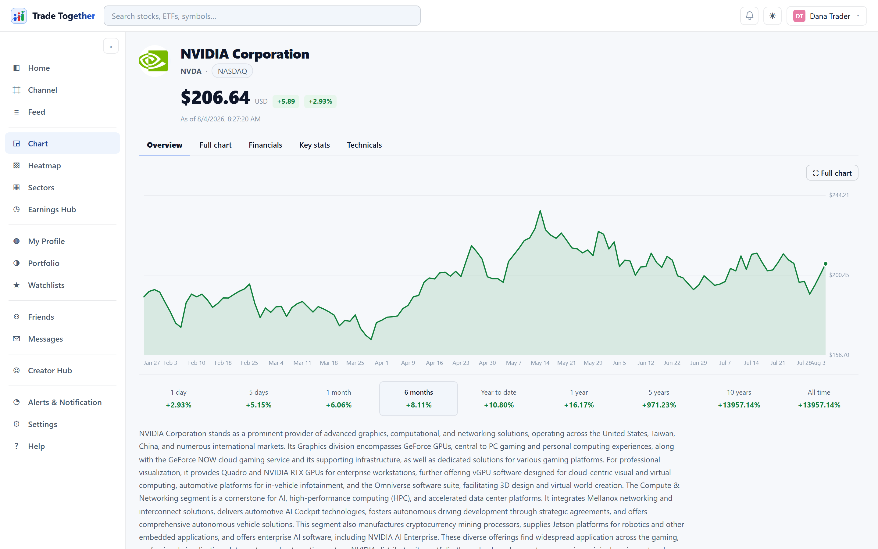
The chart page is the deepest screen in the app. It covers one instrument at a time. Seven tabs are always there: Overview, Full chart, Financials, Balance sheet, Key stats, Technicals and News. An eighth, Holdings, appears only when the symbol is an ETF — a fund is the one instrument where “what is this made of” is a real question, and for a single company it is not one at all.
Balance sheet. A snapshot on one date of everything the company owns, everything it owes, and what is left over for shareholders. Unlike revenue or profit it does not describe a period — it describes a moment, the last day of the quarter or year shown. Two bars at the top say the whole thing: they are the same length by arithmetic, because everything a company owns was paid for either by borrowing or by its owners, and the split inside the second one is how much of it is actually the shareholders'. Below them the line items in plain English — cash, what customers owe it, inventory, debt due within a year, long-term debt, profits kept in the business — each with the change from the period before. Then three readings: the current ratio, net cash or net debt, and the share owned outright. Those are descriptions, not verdicts. Pick any of the last five periods from the row of buttons.
Every figure on that tab came out of one document, and Read the filing yourself opens it: the statement the company filed with the SEC, at sec.gov, not our summary of it. A line the provider did not supply is left out rather than shown as zero — on a balance sheet a zero is a claim, and a gap is not.
News. The last tab carries stories about this company from the past seven days, newest first, each with its publisher and how long ago it ran. Headlines open at the publisher in a new tab — we do not host or rewrite them. Where a story has a picture it appears beside the headline, and it is fetched by us and served from this site rather than loaded from the publisher — so reading a story here does not tell them who you are. Nothing older than a week appears, so a quiet week is an empty list rather than a page of stale news. A shorter version of the same list sits at the bottom of the panel on the right.
9.1 Opening a chart
Any of these work:
- Type a ticker or a company name into the search box at the top and pick from the list.
- Click a symbol anywhere in the app — a watchlist row, a heatmap tile, a feed card, an earnings entry.
- Go to the address directly:
/#/chart/AAPL.
The header shows the company logo, its name and ticker, the exchange, and the live price with the day's change.
Under the price is the time the price was measured — not the moment the screen was drawn. If what we are showing you came from a store rather than fresh from the exchange, the line says Cached and gives that older time. A price that is a few minutes old is completely normal and usually harmless; what would not be acceptable is a clock that keeps moving while the number above it stands still, because that is a stale price dressed up as a live one.
9.2 Overview
An area chart of the price, and underneath it a row of eight periods: 1d 1w 1m 6m YTD 1y 5y All. Each one shows the return over that window and is a button — clicking it redraws the chart over that period.
The same eight appear on the full chart's Range bar and on the phone, so moving between the three never asks you to translate.
A period only appears if the company has been listed that long. On a company that floated three years ago there is no 5y button, because there is no five-year return to show — All covers everything back to its first day of trading and is the honest answer. The alternative would be to print the since-listing figure twice under two different headings, one of which would be wrong.
Below the chart: the company description, and under that Quarterly performance — four small charts covering the last five reported quarters and the one still to come: earnings per share, revenue, net margin and free cash flow.
They are measured in different things — dollars per share, dollars and a percentage — so each gets its own chart and its own scale rather than being squeezed onto a shared one, where the largest would flatten the rest. The pale line behind each is the same quarters a year earlier, so the gap between the two lines is the year-on-year change at its real size. Hover any chart to read both years and the change between them.
9.3 Full chart
⛶ Full chart expands the chart into a working candlestick view without leaving the page. The top bar carries:
- Timeframe
- 1m, 5m, 15m and 1H are genuine intraday bars; D, W and M are daily and above. Intraday history is a fixed recent window — panning further back does not widen it.
- Chart type
- Candlestick, Heikin Ashi, Renko or Kagi.
- Indicators
- A multi-select — see below.
Under the chart sits the Range bar — 1D 1W 1M 6M YTD 1Y 5Y All. It sets how much history the chart shows, one is always selected, and it is the same list as the Overview pills and the phone.
1D is the one that also changes the bars: a single day of daily candles would be one box, so a day is drawn from five-minute bars. Pressing any other range puts it back on daily ones.
- Zooming
- Scroll to zoom in and out — no modifier key — and drag to pan — sideways across dates, and up or down to slide the candles with your hand, so the series follows you in any direction. The automatic fit keeps working underneath: pan to a different stretch of history and the chart still frames the bars, it just keeps the displacement you asked for. If you are already looking at the newest candle, zooming out keeps it against the right edge and reveals older bars to the left, so the present never scrolls away from you. Zooming in magnifies around whatever is under the pointer. Panning past the oldest bar quietly fetches more history, so you can keep going back.
- Stretching the price scale
- The price axis down the right-hand side normally fits itself to the bars on screen. Drag it up or down to overrule that: up makes the candles taller, down flattens them. It is the fix for a quiet stock inside a wide range, which auto-fitting draws as a near-flat line, and for a choppy one that is all noise. The chart keeps following the prices either way — stretching only says how much to exaggerate what it finds, so panning somewhere else still frames the bars properly. Double-click the price axis to hand it back to auto-fit.
- Getting back
- Zooming moves the view without changing which range button is lit. Click the lit button again and the chart snaps back to exactly that range. Double-clicking the chart does the same. And once you have scrolled away from the newest bar or stretched the price scale, a small ⟲ Reset graph button appears at the right end of the top bar — one click puts the range, the newest bar, the price scale and any vertical slide all back.
- Full-screen graph
- The ⛶ Full-screen graph button at the right end of the top bar clears the page down to the chart: only the plot, its controls, the drawing tools and the watchlist rail remain, still inside your browser tab. Press it again — or Esc, or the browser's Back button — and you are back in the app exactly as you left it.
- From the keyboard
- The chart is a tab stop, so you can reach it without a mouse — Tab until it takes the focus ring. ← and → pan through time a tenth of a screen at a time, ↑ and ↓ slide the candles up and down the same way, + and − zoom, and Home puts everything back: the dates and the price scale together.
On the right sits a rail with a watchlist table (click a row to switch the chart to that symbol), the instrument's detail, and key statistics. The table shows its first ten rows; Show all underneath opens the whole list in pages of 25, and Show less folds it back to the summary.
Drawing on the chart
The rail down the left of the full chart marks it up. Pick a tool, then click the plot: Horizontal and Vertical take one click, and Trend, Ray and Rectangle take two — one for each end. The tool releases itself once the shape is finished, so you are back to panning without having to put it down. Esc abandons a shape you have started but not finished.
The six swatches set the colour of the next drawing; each shape keeps the colour it was drawn in, so you can separate one idea from another. Drawings are stored against the price and the date, not against the screen, so they stay on their bars through any zoom, pan or change of range, and they are still there when you come back to that symbol another day.
Pencil is the odd one out: hold the mouse button down and draw freehand, and let go to finish. The line is stored against the same prices and dates as every other drawing, so it stays on its bars through any zoom.
Whatever you have just drawn stays picked up, so Delete and the rail's Delete button remove it straight away — you do not have to go back and select it first.
To change an older drawing, press Select in the rail and click it. It thickens and grows a dot at each end: drag the middle to move the whole thing, drag a dot to move just that end, and press Delete — or the rail's Delete button — to remove that one drawing. Picking a colour while something is selected recolours it rather than only setting the colour for the next one. Press Select again, or Esc, to go back to panning the chart.
Clear is not the same as Delete Delete removes the one drawing you have selected. Clear removes every drawing on that symbol at once — there is no confirmation and no undo, so treat it as the blunt instrument it is.
Some buttons in the full-chart toolbar are greyed out: split layout, replay, undo/redo, snapshot and trade. They are visible but not built. Nothing you do will make them work — they are not broken, and there is no setting that switches them on.
Folding the side panel
Every section of the chart's side panel — the watchlist, the price card, Key stats and News — can be folded down to its title line. Click the title (or the small arrow beside it) to fold or expand a section; your choices are remembered on this browser, so the panel opens tomorrow the way you left it today.
9.4 Indicators
Open the Indicators menu and tick as many as you want. Each one you turn on adds a small badge above the chart, so you can see at a glance what is drawn — and, for most of them, change its settings without leaving the chart.
Drawn over the price
- Moving averages
- Simple averages of the last N closes, at 5, 10, 50, 150 and 200 bars. Shorter ones hug the price; longer ones smooth it into the trend. A long average often sits well away from the recent price — that is the point of it — so the price scale widens to keep the line on screen. The candles look a little flatter as a result, and the average stays visible however far in you zoom.
- MA custom
- A moving average of whatever length you choose. Turn it on, then edit the number in its badge above the chart — anything from 2 to 400 bars.
- EMA
- An exponential moving average: the same idea, but recent bars count for more, so it turns sooner after a change in direction. Faster is not better — it is a different trade. It reacts to noise a simple average would have ignored.
- VWAP
- The average price actually paid, weighted by how much traded at each level. It is what trading desks measure their own fills against: above it you paid more than the crowd did, below it less. On intraday timeframes it resets with each session, which is the real thing. On daily bars and longer it runs from the start of the loaded history — that is an anchored VWAP, a related but different measure.
- Bollinger
- A moving average with bands a number of standard deviations either side (standard: 20 bars, 2 deviations). The bands widen when price is volatile and narrow when it is calm. Price pressing against a band means it is stretched relative to its own recent range — which is not the same as expensive, and not a reason on its own to expect a turn.
- Fibonacci
- Retracement levels across the high and low currently on screen, and they move as you pan. We would rather you knew what this one is: there is no mechanism that makes a price respect these ratios, and 50% is not a Fibonacci number at all. What these levels have is an audience — enough people watch them that they occasionally matter. That is a fact about the crowd, not about the company.
In their own panel below
These are measured in something other than price, so they get their own box rather than being drawn over the candles. They share the chart's time axis, so a point in a panel always sits under its own bar.
- Volume
- Shares traded per bar. Green bars closed up, red closed down. A move on heavy volume carries more conviction than the same move on thin volume.
- RSI
- A 0–100 measure of how one-sided the recent moves have been (standard: 14 bars). Above 70 is conventionally read as overbought, below 30 as oversold. It says nothing about direction, and a strong trend can hold it above 70 for weeks — selling every reading over 70 is one of the most reliable ways to be early.
- Stochastic
- Where the close sits inside the recent high–low range, also 0–100. It is worth having alongside RSI because the two ask different questions: RSI asks how one-sided the moves have been, this asks how near the top of its range the bar finished. A share can grind up on small daily gains — high RSI, unremarkable stochastic — or gap to the top of a month's range in one session, which is the reverse.
- MACD
- The gap between a fast and a slow exponential average (standard: 12 and 26), plotted against its own signal average (standard: 9), with a histogram of the difference. It is built from averages, so it always lags the turn it reports; in a sideways market it crosses constantly and means nothing.
- ATR
- Average True Range — how far this share typically moves in a bar, in its own currency. Not a signal. It has no direction and no overbought level. Its use is sizing: a stop placed inside 1 ATR is a stop that ordinary noise will hit, whatever you think of the company.
- ADX
- How strongly price is trending, with two direction lines (+DI green, −DI red) underneath it. Below about 20 there is no trend — which is exactly when crossovers and breakouts fire constantly and mean nothing. Its real value is telling you when the other indicators are lying.
- OBV
- On-Balance Volume: a running total that adds a bar's whole volume on an up close and subtracts it on a down close. The number itself is meaningless — it depends on where the data happens to start — so no scale is drawn. Only the shape is information: volume accumulating while price goes nowhere, or the line falling while price makes new highs.
Changing the settings
An indicator marked C in the menu has numbers you can change. They appear in its badge above the chart once it is on — edit one and the chart redraws immediately, because the badge sits where you can watch the line move.
The standard settings are conventions, not laws RSI-14 is the period Welles Wilder happened to choose in 1978, and MACD's 12/26/9 comes from the same era. They are worth knowing because everyone else is looking at them — but nothing makes them correct. You are welcome to change them.
So that you never forget you have done so, a badge whose settings are away from standard is tinted and grows a ↺ button that puts everything in it back. Each box is bounded, too — there is no RSI-1, because there is nothing sensible for it to compute.
Your settings are remembered per company, alongside which indicators you had on, and follow you to any device you sign in on. A period that suits a slow index fund is the wrong one for a small cap, so the chart does not make you re-tune it every time you switch.
Volume, VWAP, OBV and Fibonacci carry no C, because there is genuinely nothing to choose: they have no period, and offering a number that changed nothing would be worse than offering none.
Each indicator has a ? next to it in the menu explaining what it measures, how it is conventionally read, and what it does not tell you.
9.5 Financials
A table where every line — revenue, gross profit, net income, net margin, total debt, cash, free cash flow — carries a five-period bar showing its shape over time, its latest value, and its one-year change. A loss draws in red below a marked zero line, so a bad quarter can never dress up as a small good one. It opens on Quarterly — the freshest fact about the company — with Annual one click away at the top. Any row or card can be clicked to open it full size.
Under the table:
- Performance — price change over each trailing window, computed from daily closes.
- Seasonals — each year's price path rebased to zero on 1 January, overlaid, so recurring patterns in the calendar year are visible.
- Revenue → Net income — a waterfall showing how the period's revenue became its profit. Red bars are money spent, green is gained, blue are running subtotals. It has its own Annual/Quarterly toggle plus chips for the last four quarters or three years.
9.6 Balance sheet
One filing at a time: what the company owns, what it owes, and what is left over. The two bars at the top are the same length by arithmetic — everything a company owns is funded either by somebody it owes or by its own equity — and the split inside the second bar is the question worth asking: how much of what this company owns is actually its own.
Every period carries a link to the filing it came from, at the SEC. A line the filing does not report is left out rather than shown as a dash or a zero, because on a balance sheet a zero is a claim — "this company holds no inventory" — and a missing field is not.
Table and Charts read the same filings two ways:
- Table
- One filing, in full, with the line items grouped into assets, liabilities and equity, and each one's change against the period before.
- Charts
- Every filing that came back, oldest on the left. Who has a claim on what the company owns; what the assets actually are; and cash against debt side by side — those two are compared, not added, so they are drawn as neighbours rather than stacked.
- Kept, and handed back
- The one chart the table cannot show. Retained earnings is the balance-sheet line dividends come out of, so the figure a company reports is already a "without dividends" number. The dark band is what it kept; the pale band on top is what it paid out in that same period, so the whole column is what retained earnings would have been had nothing been distributed. The pale band is one period's dividend, not every dividend the company has ever paid. The chart only appears for companies that pay one.
ETFs do not have this tab. A fund files no balance sheet of its own — no inventory, no goodwill, no long-term debt — so there would be nothing true to put on it. Holdings is the tab that answers "what is this made of" for a fund.
The readings at the foot describe what the numbers are, in plain words, and stop there. Nothing on this tab is a recommendation to buy or sell anything.
9.7 Key stats
Four grids of company facts: valuation (market cap, P/E, EPS, beta, last dividend), the latest reported earnings, per-employee figures, and details (sector, industry, CEO, headquarters, website, IPO date).
Every figure states its own basis when the basis matters — “Basic EPS (TTM)” says it is the sum of the last four reported quarters, “Last dividend per share” says it is not annualised. Hover the ? for the rest.
9.8 Technicals
Three dials, and they are not the same kind of thing:
- Technicals
- Calculated by this app from price history — a combination of the 14-day RSI, MACD and moving averages. It is arithmetic on past prices and nothing else. It does not know what the company does, what it earns, or what happened in the news this morning.
- Analyst rating
- The published consensus of the analysts covering the stock, with the number of analysts it summarises. This is a report of other people's opinions, not ours. Some symbols have no coverage at all, and the panel says so rather than showing an empty dial.
- Fear & Greed — this company
- How the crowd is behaving about this one company, averaged from
five signals in its own price history: where the price sits in its
52-week range, how far it is from its 125-day average, RSI, whether
volume has picked up, and whether the tape has gone quiet or violent.
Each of the five is listed under the dial with its own score, so you can
check the reading rather than take it on trust. A signal the history
cannot support is left out instead of being counted as neutral, which is
why the list is sometimes four items rather than five.
This is SigniBull's own reading and is not the index of the same name published elsewhere. For the whole market rather than one company, add the Market mood card to your dashboard — that one carries CNN's index and credits CNN.
Both ends of the dial are drawn in red. Extreme greed is not "good" and extreme fear is not "bad"; they are two ends of a temperature, and nothing here is a recommendation to buy or sell anything.
9.9 Holdings (ETFs only)
When the symbol you are looking at is an ETF rather than a single company, one extra tab appears: Holdings. It is not there for a company, because a company is not made of other companies.
The top of the tab is the fund itself: who runs it, how many companies it holds, what it charges a year (the expense ratio), how much money is in it, its NAV, what kind of assets it buys, where it is domiciled, and the date it launched.
Below that the fund is broken down two ways — by sector and by country — largest first, each with a bar beside it. The bars are drawn against the biggest slice rather than against 100%, so the ranking is readable; the number printed beside each one is always the real percentage.
What this tab does not show, and why. It is the fund's composition by sector and by country — not a list of the individual companies inside it. The company-by-company breakdown is not available on our current data plan. We would rather show you the whole fund at the level we can actually source than show a partial list of names and let it look complete.
The figures come from our data provider and are refreshed at most once a day, which is as often as a fund restates them.
9.10 What the chart remembers
Your tab, the period, the chart type, and which indicators you had on are saved and restored the next time you open a chart. Indicator choices are remembered per symbol, so a set-up you built for one stock does not follow you onto the next one. Because it is stored on your account rather than in the browser, it follows you to another device.