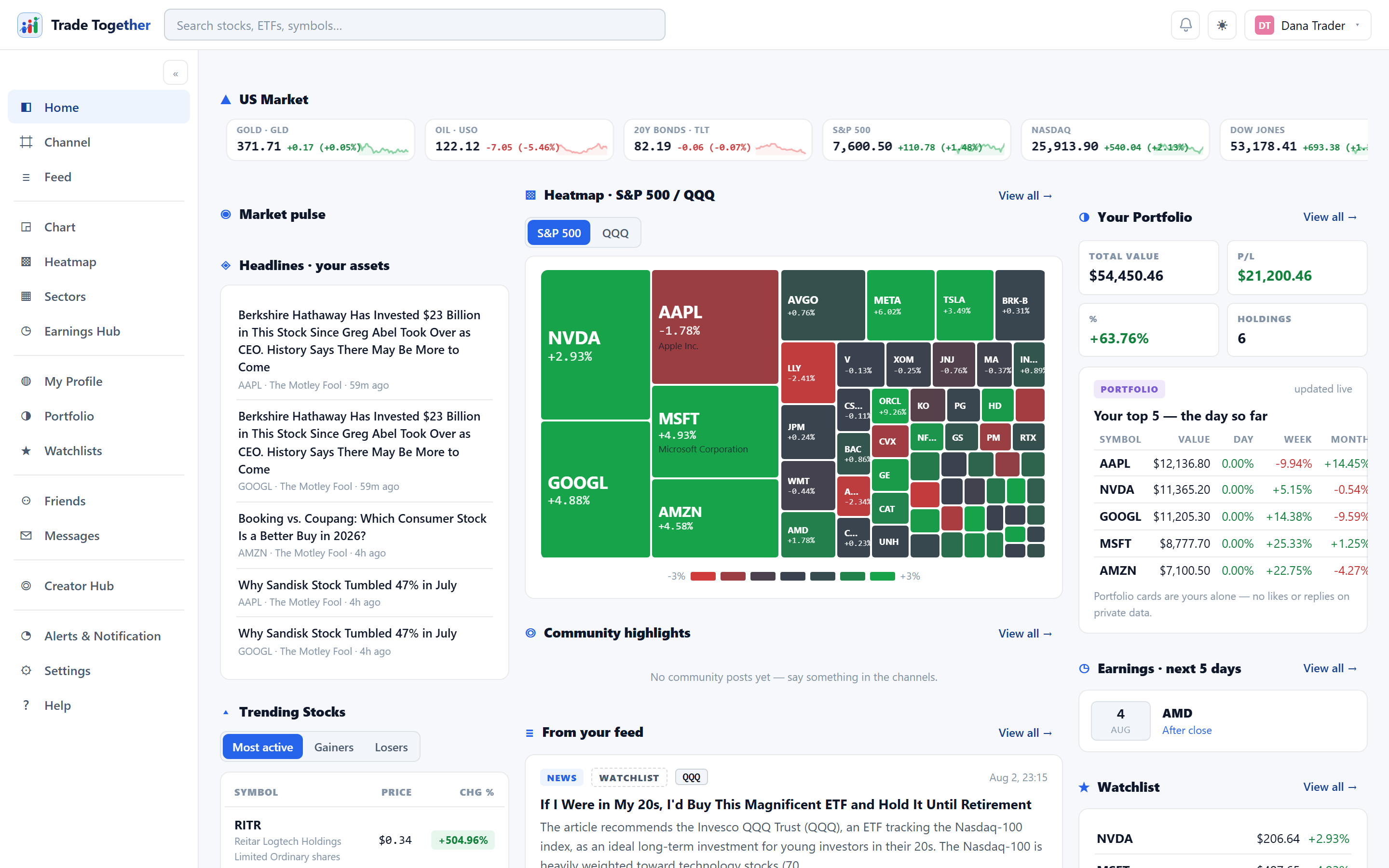
Home is one page in two parts. The top row is fixed: your portfolio value, Market Sentiment and Volatility (VIX) — the same three cards for every member — and the First steps card while yours is unfinished. Everything under that row is a layout: widgets on a sheet of squares that you can move, resize, swap and add to. You can keep several layouts and switch between them with one click. Until you change anything, the layout you get is the one this chapter describes.
- The Layout strip
- Above the page title, under a line, always visible: the word Layout, one chip per layout you have — your first is called Home — and + New layout. On the right, Shared with me, the layouts other members have sent you, and ✎ Edit layout, which unlocks the sheet. Click a chip to switch layouts; double-click one to rename it. Every control Home has lives on this one row.
- Your portfolio value
- A wide blue panel carries the total, what it has done today, what it has done since you started, and a line of the value itself across the last quarter, with its highest and lowest points written on it and a dashed line marking where the window opened — above that line is up over the period, below it is down. The big figure is the verified total — the one replayed from the trade log, which nobody can edit — and holdings you typed in yourself are named underneath with their own amount rather than folded into it. The line is the same replayed curve the Portfolio page draws, so a position you have closed still shapes the past it happened in; if you have no verified trades yet, the panel shows your own entries and says so, and draws no line. The panel is not there at all until you own something.
- Market Sentiment and Volatility
- The panel shares its row with two market cards. Market Sentiment says whether the day is bullish, mixed or bearish, with the share of US stocks advancing and the current session (pre-market, open, after hours, overnight, or weekend). Volatility (VIX) leads with the word — Calm, Normal, Elevated or High — in green, amber or red, with a sentence saying what the market is pricing and a red-amber-green scale from 10 to 40 with a marker at today's reading. Everybody can read "+2%"; almost nobody can read "14.2", so the card answers that first and shows the number beside it. While you are editing the layout these three cards say Pinned: they are on every layout and are not part of any.
- Your first sign-in
- It opens a short welcome wizard — three questions, a card about Home, and one more question: why you came, three stocks you know, whether you have traded before, a look at how Home is arranged (with the choice to land in edit mode when the wizard ends), and whether you want getting-started emails (off unless you say yes; one-click unsubscribe on every mail, and a switch under Settings → Emails). Your answers seed your watchlist, so the page below is about your stocks from the first minute. Skipping is fine — the wizard never returns either way. While your first steps are unfinished, a First steps card sits under the top row: five items, the wizard's two already ticked, each remaining one a link to the place it happens. Finish all five and it retires itself, leaving a small badge on your profile; the ✕ hides it for good after asking once. Placing your first paper trade and setting your first alert are read from the record itself, so ticking happens on its own.
- The layout you start with
- It reads top-down, the way a desk reads the morning. Across the top, a continuously scrolling ribbon of the four major indices followed by five macro ETFs — small caps (IWM), semiconductors (SOXX), gold (GLD), oil (USO) and long-dated Treasuries (TLT); it pauses when you hover over it, and every entry opens its chart. Under it, the whole market in one row: the Heatmap half wide, with its S&P 500 / QQQ switch — the one card you read without reading — and beside it Sector performance and Trending symbols — today's most active names, biggest gainers and losers. Then what the wire and the calendar say: the market's Headlines half wide, Earnings · next 5 days and What members are doing — the symbols members here bought or added to a watchlist this week. And at the bottom, your own row: Your money — the verified figures and today's movers among your positions — your Watchlist, and the news about your companies, headlines for the ones you hold and then the ones you watch, no story twice. Your headline number is already pinned above the grid, which is why your own row can come last: it adds the detail, not the fact. Every card is a summary of a fuller page, reachable by its View all →.
- Arranging it
- Press ✎ Edit layout and the sheet shows its squares. Drag a card by its ⠿ handle, resize it from its corner or its edges, ✕ hides it, + Add widget opens the marketplace of every card in the app, and Save as… keeps the arrangement under a new name. ✓ Done editing locks it in. The full mechanics — placing on an exact square, nudging, per-card settings, sharing a layout — are in Custom Dashboard.
Your money is empty until you own something, and the news until you hold or watch something. That is not a fault — add a holding or a watchlist symbol and the cards build themselves around it.
On a narrow screen the cards stack one under another, in the order of the layout, with the top row first.