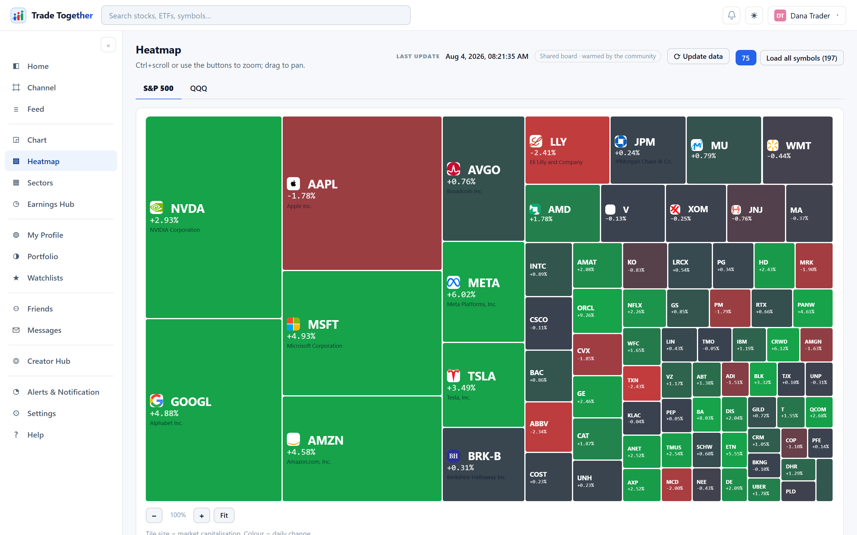
The whole market on one board. Each tile is a company: its size is how big the company is, its colour is how it has moved today — green up, red down, and the stronger the shade the bigger the move.
- S&P 500 / QQQ / Sectors / Magnificent 7 / Semiconductors / Crypto
- Six boards; switch between them at the top. S&P 500 and QQQ are companies. Sectors is the eleven GICS sectors, moved here from the Sectors page — every tile shows the sector's full name and the tracking ETF it is measured through (XLK, XLF and so on), with the same Day, Month, FY and 12-month windows as the sector table. Magnificent 7 is the seven names those funds hold — the fund itself is not a tile, because it is the wrapper around the seven and drawing it too would draw the board twice. Semiconductors covers the chip designers, the foundries and the equipment makers that build the fabs. Crypto is the major coins by market value; stablecoins are left out on purpose, because a coin pegged to the dollar never moves and two enormous flat tiles would cost the picture a fifth of its area to say nothing.
- The members of one sector
- On the Sectors board, a row of buttons under the tabs picks a single sector — Technology, Energy and the rest — and redraws the board as that sector's leading companies instead of the eleven averages. It answers the question the sector map provokes: the sector moved, but because of what? These boards show today's move only; the Day / Month / FY windows apply to the eleven-sector map, because a company quote carries today's change and nothing further back.
- Zoom and pan
- Ctrl + scroll, or the zoom buttons, to get closer; drag to move around.
- Load all symbols
- The board opens with the 75 largest names so it appears quickly. This loads the rest.
- Why a board appears instantly
- A finished board is the most expensive thing the app builds — one price call per company — and it is the same board for everyone, so it is pulled once and shared. Whoever opens it first pays the calls; everybody after paints from the stored copy. A copy older than ten minutes stays on screen while a fresh one is fetched behind it, so you never wait at a blank page. This applies to every board, including a single sector's members.
- ⟳ Update data
- Throws away the stored board and pulls fresh quotes. Next to it, a timestamp shows when the data was captured — see chapter 30 for why boards are shared.
About the constituent list The companies on each board are a hand-picked list of large caps. It is not a licensed S&P 500 or NASDAQ-100 membership list, because no data provider on the plans this app uses sells one. So the board is representative rather than exact, and the page says so next to the legend.
The colour stops at 3%. The scale runs from −3% to +3% and everything past that is the same darkest shade, so a company down 12% looks exactly like one down 3%. This is worth knowing before you read a board on a bad day. The alternative is worse: scaling the colour to the worst mover means one company collapsing 40% washes the entire board pale and the other four hundred become unreadable. Hover a tile — or open it — for the actual figure.
Size and colour are answering different questions. A small red tile on a green board is one company having a bad morning. A large red tile is a bad morning for everybody holding an index fund, because a big enough company moves the index by itself. Reading the two together is the whole point of a treemap: a list sorted by percentage change puts a tiny company at the top and tells you nothing about whether it mattered.
Clicking any tile opens that company's chart, which is usually the next thing you want — the board tells you where to look, not why.