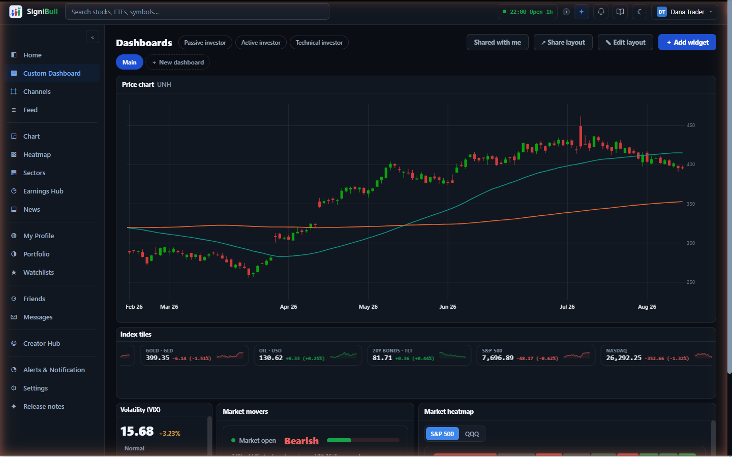
Custom Dashboard is what Home becomes when you press ✎ Edit layout: every card under the top row is a widget on a sheet of squares, exactly the size you give it, and you can pick any of the app's widgets for it — the index ribbon, the heatmap, sectors, headlines, your watchlists, a company's chart, market volatility and more. What you arrange is a layout, and you can keep several.
- Adding widgets
- While editing, press + Add widget. The marketplace lists every widget in the app with a one-line description and a small picture of its layout — click the picture for a larger look. It is a sketch with made-up numbers, not live data. Add places it on the sheet. Watchlist, Price chart and Key stats can each be added more than once.
- Arranging — like squared paper
- Press ✎ Edit layout on the Layout strip and the sheet shows its squares as light dashed boxes. A widget's size is its count of squares: drag the ◢ corner to grow or shrink it square by square (a small readout counts along, e.g. 12 × 6). To change one dimension on its own, drag the right edge for width or the bottom edge for height — the other stays exactly as it was. Widgets go down to three squares wide by two tall; as one gets smaller it tightens its own spacing and type so what is on screen stays readable, and anything that no longer fits scrolls inside the card rather than being cut off. Drag a card by its title bar or ⠿ to move it — it follows the pointer, and the cards it displaces slide out of its way — and ✕ hides it. Press ✓ Done editing to lock it in.
- Settings for one widget
- While the layout is unlocked, every card carries a ⚙. It sets the text size for that card on its own — small, normal or large — and offers Recommended, which puts the card back to the size the widget was designed at, for when resizing has left it too cramped to read. A watchlist card also picks which of your lists it shows, which is what lets two of them show two different lists.
- Several layouts
- The chips on the Layout strip each hold their own layout. + New layout makes an empty one; Save as… (while editing) copies the layout you are on under a new name, so you can try a rearrangement without losing the one you had; double-clicking a chip renames it, and Delete layout on the edit strip (or ✕ on the active chip) deletes it — never your last one. Your first layout is called Home. The top row — your value, Market Sentiment, the VIX — is pinned: it is on every layout and is not part of any.
- Building a screen with AI
- An empty layout opens on a question: what do you want to see when
you open SigniBull? Answer in your own words — the companies you
follow, whether you invest for the long term or trade actively, what you
want to keep an eye on — or tap one of the examples under the box, which
fills it in for you to adjust. ✦ Build with AI on
the Layout strip starts a new layout straight on that question.
Nothing is saved until you choose. You first see the proposed screen drawn to scale, each card with the reason it was picked, and a name you can change. Use this screen keeps it; Use it and edit keeps it and unlocks the sheet so you can move and resize cards yourself; Change something takes one line — add a chart of NVDA and remove the news — and shows the revised screen in its place. Start over goes back to your request.
The AI only arranges cards that already exist in the app, and a company-specific card only gets a company you named. It never sees your portfolio or your watchlists, and it gives no advice about what to buy or sell. You can build up to fifteen screens an hour.
It only uses cards that are in the widget store. If you ask for something the store does not have yet — an options chain, say — the preview says so under the screen, builds the rest from what exists, and we count what was asked for so the most wanted cards are the next ones built.
- The cards about one company
- Price chart, Key stats, Technicals, Analyst rating, Financials, Performance, Waterfall and Dividends show a single company rather than the whole market, so each one asks which — open its ⚙ and search for any company by name or ticker. The symbols already in your watchlists and portfolio are what it offers before you type. Add either of them twice to compare two companies side by side; the card title says which is which.
- Dividends
- One company's dividend: its current yield, how often it pays and how much per payment, the last ex-dividend date (own the shares before it to receive the payment) and the day it was paid. Under them, the total paid in each of the last five calendar years as bars, with this year hatched because it is not over, and the change from the first full year to the last. A company that pays nothing says so. It is a record of what was paid, not a forecast.
- Market mood
- A fear-or-greed dial, from 0 (extreme fear) to 100 (extreme greed). It
shows CNN Business's published Fear & Greed index
when that is available, with all seven of its measures listed under the
dial and a link to CNN's own page — momentum, 52-week highs against
lows, breadth, options, volatility, demand for junk bonds and demand for
safety. The card names CNN on its face, because it is their number and
not ours.
When CNN's index cannot be reached, the card falls back to our own reading of four measures we can compute ourselves: how far the market is above or below its own 125-day average, where volatility sits, how much of the market is participating today, and whether money has been moving into shares or into long bonds over the last month. The note under the dial always says which of the two you are looking at, and when one of our four cannot be read it is left out rather than guessed — which is why that version says how many it used.
Either way, treat it as a description of the mood, never as a signal to act on.
- Sharing a layout
- ↗ Share layout (while editing) publishes the layout you are looking at, so other members can start from it. Only the arrangement is shared — which cards, what size, and what each card is set to show. Nothing about your portfolio, your holdings or your trades travels with it, and the name of a watchlist is left out too, since it is a label only you have. A layout sent to you waits under Shared with me on the strip until you tick it; ticked ones appear under From other members on an empty layout. The same dialog lists what you have published and takes any of it down again.
- The Price chart card
- Its ⚙ sets three things: which company — searched by name or ticker, so it is not limited to symbols you already follow — how far back it draws (1 month to 2 years), and which moving averages to lay over it. Volume can go underneath. The settings are yours and are remembered.
- Where it is saved
- Layouts save to your account as you edit, so they follow you to your phone and survive clearing your browser. If the same layout is edited in two places, the most recent change wins.
Everything on Home is the same card you know from elsewhere in the app, showing the same figures — arranging them differently never changes what they say.
Placing a card exactly where you want it
In edit mode you can drop a card on any square of the graph paper — drag it by its title bar or ⠿ handle and let go when the blue rectangle under it covers the squares you want. While you drag, the card lifts and follows the pointer, the page scrolls when you carry it to the top or bottom of the window, and a blue rectangle glides along to show exactly which squares it will take if you let go where you are. A card placed this way stays pinned to that square; the other cards flow around it. To put a pinned card back into the automatic arrangement, drop it onto another card — that also reorders it, exactly as before.
Nudging a card one square at a time
In edit mode each card's toolbar carries four arrows. They move it one column left or right, or one row up or down — which is most of what fine-tuning a layout actually is, and far easier than aiming a drag at a single square. It also means the board can be arranged on a touchscreen or from the keyboard. A nudged card becomes pinned to its square (the arrows first adopt wherever it is sitting, so the first press moves it by one square, not to the corner); drop it onto another card to return it to the automatic arrangement.