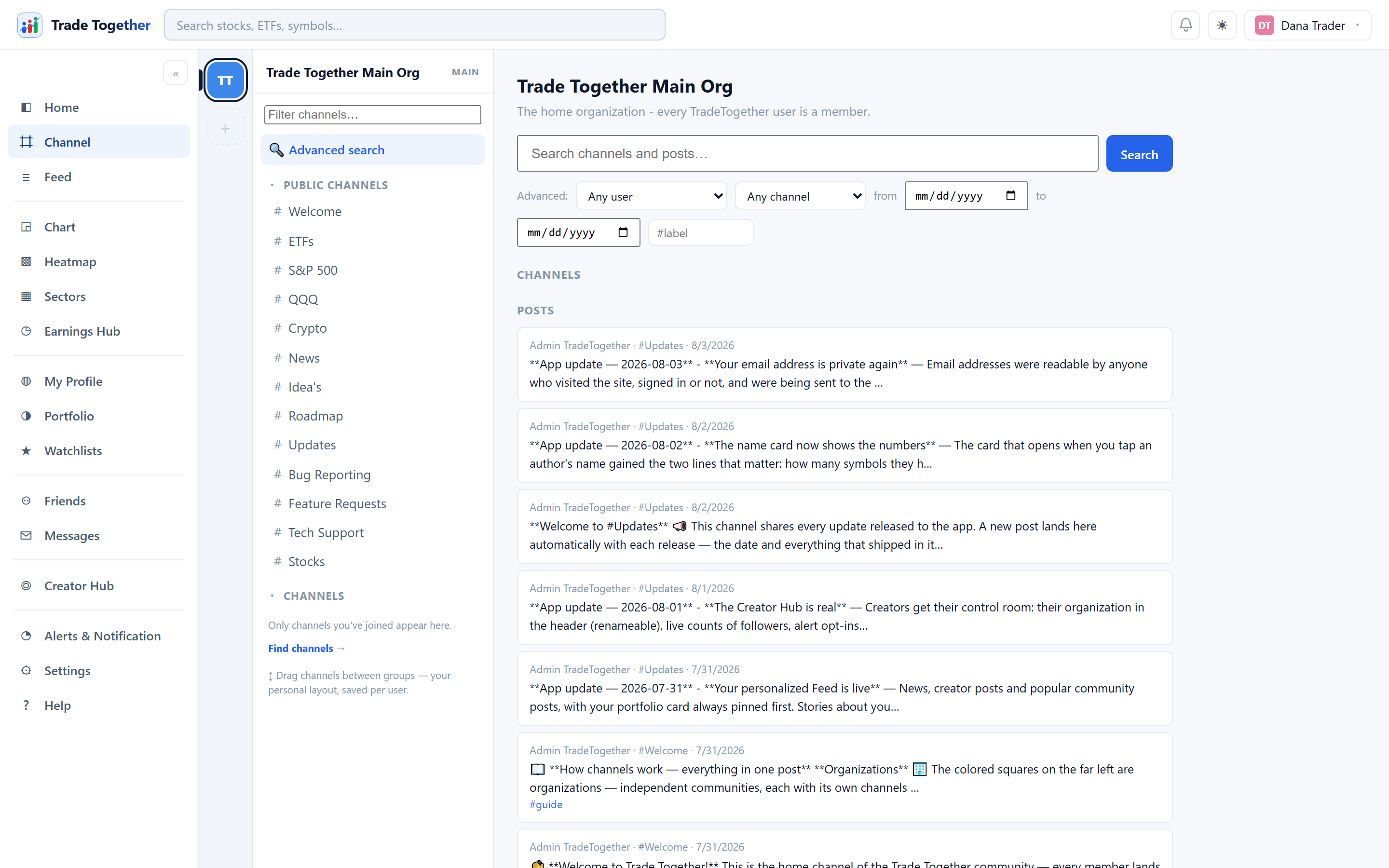
Every page has the same two pieces of furniture: a sidebar down the left and a bar across the top. Neither ever changes, so once you know them you know how to reach everything.
The market clock
To the right of the bell is the New York time and the state of the US stock market: a green dot while it is open, blue while it is shut, and how long until that changes — so "opens in 2h 14m" during the morning, "closes in 40m" late in the session. Hover it for the whole sentence.
It knows about weekends and about the public holidays the market closes for, including the two half-days that end at 13:00 — the day after Thanksgiving and Christmas Eve. It does not know about an unscheduled closure, which is rare and announced in advance; on such a day the clock would read open.
On a phone
Below about 760 pixels wide the layout changes. Five destinations — Home, Chart, Portfolio, Feed and Channels — move to a bar along the bottom of the screen, where a thumb can reach them. Channels is there rather than News because a channel is where a conversation is waiting for you, while News is somewhere you go once you have decided to read. Everything else, News included, is behind the ☰ button at the top left, which slides the same menu in from the side. Tap outside it, press Esc, or go anywhere at all and it closes itself.
It is the same menu and the same pages as on a computer, not a reduced version — nothing is missing, it is only arranged for a narrow screen. The chart and the heatmap still want a larger one to be comfortable.
Backer badges
People who backed the crowdfunding campaign carry a small badge beside their name — on their profile, and on everything they post. There are five: Early Believer, Founding Member, Founding Creator, Design Partner and Patron. Each has its own shape as well as its own colour, so they can be told apart without relying on colour at all.
A badge buys nothing. Every tool in the app is free for everyone, backers included — it only says somebody helped pay for the place to exist before it was easy. It is awarded by an administrator and cannot be set by the person wearing it.
The footer
Every public page ends with the same footer: five columns listing every tool SigniBull offers — markets, your money, community, learning and company — plus links to our social accounts. It is the fastest way to find a surface you have not opened yet.
Looking around without an account
On the sign-in page, Continue as a guest opens SigniBull without an account. A short message first says exactly what is open. Economic reports, Treasury yields, company financials from SEC filings, the whole Academy, the public stock analyses and this guide are open in full. Screens built on licensed market data — prices, charts, the heatmap, sectors, ETFs, news and the earnings calendar — open in their own layout with the figures blurred, because our data licences let us show them to members only. Everything that would be yours — a portfolio, watchlists, alerts, the community — needs a free account.
A GUEST tag sits in the top bar with Sign in and Create account beside it, with a language switch and the light/dark toggle, and What guests can see above every screen reopens the message. Nothing you do as a guest is saved.
4.1 The guided tour
The first time you sign in on a browser, the app offers a short guided tour: the page dims, a spotlight moves around the frame, and a card beside each stop says what lives there — the groups on the rail down the left, the search box up top. Eight stops, about a minute.
- Next and Back move between stops; Enter and the arrow keys do the same.
- Skip tour or Esc ends it at any point. Nothing is lost — every stop is a place you can simply go.
- It shows itself once per browser. Sign in on a new device and you get one showing there too.
Want it again? ⚙ Settings → Guided tour → Take the tour replays it whenever you like. On a phone the tour is shorter: it skips the stops that point at the desktop menu and keeps the ones that exist on the small screen.
4.2 The rail
Down the left is the rail: seven groups, an icon with a word under each. Every page of the app is in one of them, in the order the old menu had — nothing moved, the rows were folded — except Top Bulls, which stands on its own between Markets and Money and opens with one click.
| Group | Pages in it | Letter |
|---|---|---|
| Home | Home — your dashboard, since the two became one page | G |
| Markets | Chart, Heatmap, Sectors, Earnings hub, News, Economic reports, ETFs, Bonds | C, H, S, E, N, R, T, B |
| Top Bulls | The leaderboard — one page, so the group is the page | U |
| Money | Portfolio, Watchlists, Alerts & notifications | P, W, A |
| Together | Channels, Feed, Friends, Messages, Creator Hub | K, F, I, M, V |
| Learn | Academy, Stock analysis, User guide | Y, X, L |
| You | My Profile, Settings, Release notes — and Admin, for administrators only | J, Z, O — Q |
Hover a group and its pages fly out beside it; click one to go there. Click the group itself and you land on the page you last used in it — the first one, the first time. The group you are in is lit. With a keyboard, Tab to a group opens its flyout and Esc closes it.
The strip. Across the top of the page, the pages of the group you are in sit as tabs, so moving from Chart to Heatmap is one click along the top rather than a trip back to the rail.
Pins. The ★ next to any page — in a flyout or on the strip — pins it to the foot of the rail, up to four. Click the star again to unpin. Your pins are remembered in this browser.
G, then a letter. Press G anywhere (not while typing in a box) and a card shows every page with its letter; press the letter and you are there. The letters are in the table above and in every flyout, so they are learned by seeing them.
Icons only. The « at the foot of the rail hides the six words and narrows the rail, which is worth doing on the chart page; » brings them back. The same switch is in ⚙ Settings, and the choice is remembered.
Together carries a red count when you have unread messages or unread channel posts; open it and the flyout says which. An Admin page appears in You for administrator accounts only — if you cannot see it, it is not for you and nothing is missing.
4.3 The top bar
- The logo
- Clicking it goes Home from anywhere.
- The search box
- A door rather than a field. Click it, or press Ctrl
K from anywhere in the app (⌘ K on a
Mac), and a panel opens over the page.
Type a few letters of any page and it appears: three letters of “bonds” reaches Bonds, and the rest of that band of the menu comes with it — somebody looking for one market page usually wants the area rather than the single page they happened to remember. Each result says which band it lives in, so the panel teaches the menu while you use it.
Type a ticker instead and it offers that symbol’s chart, from the same symbol search it has always used. ↑ ↓ move through the list, Enter goes, and Esc closes it and puts your cursor back where it was. With nothing typed it offers a few places worth knowing about, so it is never a dead end.
The plain symbol box is still there in the seven other places you have to name a symbol — the chart rail, watchlists, the portfolio, the order ticket, alerts, the earnings hub and Home — and behaves identically each time. - What's new
- A four-pointed star, immediately left of the bell — the same mark as Release notes at the bottom of the left menu, because the two lead to the same material. It fills with a soft blue when something has changed since you were last here. Click it for the short version — a few bullets on what you gained — and Read the full note → for the whole entry in Release notes, the last entry in the left menu. It goes quiet once you have opened it, and it stays in the bar afterwards so you can go back to it. The first time you ever sign in it shows nothing: a history of changes to a product you have never used is not news.
- The bell
- An outline when there is nothing waiting; filled, with a red dot, when there is. The dot counts unread notifications and unread direct messages together. Clicking it opens Alerts & notifications.
- ☾ / ☀
- Switches between the dark and light themes immediately. Remembered per browser.
- Your name and picture
- Opens a small menu with My profile and Sign out.
4.4 Things that work the same everywhere
- Esc closes whatever is open on top — a dialog, the symbol search dropdown, an indicator menu, a profile card.
- Clicking outside a dialog closes it too, as does its ✕.
- A ? or i next to a label explains that control where a longer label would not fit. They are worth clicking; several of them cover rules you would otherwise have to learn by being surprised.
- Any ticker symbol shown anywhere is clickable and opens its chart.
- Clicking somebody's name on a post opens a small card with who they are, a Follow button and a link to their full profile.
- A View all → link on a summary card opens the full page that card is a preview of.
4.5 SigniBull on your phone
There are native apps for iPhone and Android, built from the same account and the same data as this website. Sign in with the email and password you already use — nothing is separate, and nothing needs importing.
They carry the whole product, not a cut-down version: your portfolio and holdings with every purchase behind each position, charts and indicators, the heatmap, sectors, ETFs, bonds, economic reports, the earnings hub, the newspaper, written analyses, the Academy, the feed, Top Bulls, friends and messages, and price alerts.
Two things work differently on a phone
- Simple and Advanced. A phone bar holds four icons, not fifteen. Simple mode gives you Portfolio, Feed, Top Bulls and Settings and nothing to configure; Advanced adds a More button with everything else behind it, and lets you choose which four sit on the bar. The switch is in Settings.
- Push notifications arrive with the store release. Until then a fired alert reaches your notification inbox, exactly as it does here.